Unbend Your Mind for Visual Analysis


Check out the video at the bottom of this post to learn more about the value of incremental visual analysis.
Note: The following is a guest post by Tableau Zen Master Kelly Martin.
Blank stares, then...huh?
That's what I get when I say "visual analysis." People tend to think I'm talking about making a chart. I am, but more than that, I'm talking about exploring data visually with Tableau.
Tableau co-founder Chris Stolte gave a great talk on this topic a few years ago. The video is embedded below, and I highly recommend you watch his brilliance in action.
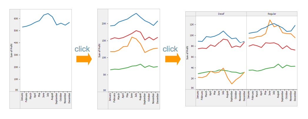
Recently I was given a Tableau workbook to enhance/fix/rejig. It had more than a dozen data sources and a dozen charts. Now, a dozen charts is nothing for Tableau, yet the dashboards were taking forever to load. And the filters weren't working in seemingly-magical ways.
It took me a while to figure out the underlying logic of the workbook. And then I realized that the analyst was still thinking like someone who only has Excel as an analysis and presentation tool.
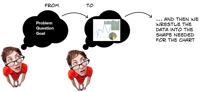
The Excel logic goes like this:
1. We get a problem or request.
2. We think of the chart we'll create in Excel.
3. We go about getting the data into the table shape we need and perform the calculation(s) on the measure as needed.
4. We make the chart.
So the person who had built the Tableau dashboard had essentially created a bunch of pivot tables, put them on separate worksheets, then connected each to Tableau to make the charts.
This is not crazy; rather, this would be the most efficient way to do it in Excel world—make a bunch of tables, then make the charts.
So, how to unbend the old Excel mindset? In short, free your mind and the rest will follow. ♫
Connect to all the data just as you would to make a pivot table. But don't try to make just one specific chart!
The visual-analysis logic goes like this:
1. We get a problem or request.
2. We connect to the data.
3. We explore the data VISUALLY. Very quickly, we can make a ton of charts (by clicking through Show Me), add dimensions, play, and see what the data has to say. We can uncover insights in relation to our problem/question/goal.
4. We combine the charts on a dashboard to communicate the results.
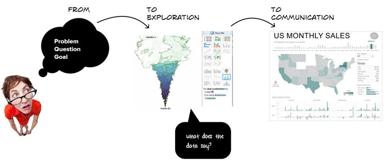
Did you notice the big difference in these two processes? Visual analysis doesn't begin with the presumption of the outcome or answer.
Wrap your head around that for a moment. I'll bet you didn't think you were presuming the outcome with the Excel process. But by reducing the data into a certain state for a predetermined presentation table or chart, you may have missed a lot of insight.
How often do you get asked to give a stacked bar chart or a pie chart of the data? That's because the requester has a hunch that the chart will show the answer to a problem. Sometimes it might. But if you visually explore the data with Tableau, I'll bet you'll find a whole bunch of new insights. It's never been so quick or easy with other tools. That's because they weren't designed for this.
So watch Chris's video below. Give it a think. And don't be afraid to go crazy with your data!
Check out additional works by Kelly Martin on Tableau Public, on Twitter, and on her blog, VizCandy.
Learn More about the Power of Visual Analysis
Zugehörige Storys

Visualizing Women's Impact to History Through Data Visualization
 18 März, 2024

Behind the Viz: Adrian Zinovei Helps You Design Your Next Dashboard
1 März, 2024

Charting the Heart: Data Visualizations on Love
 14 Februar, 2024
Blog abonnieren
Rufen Sie die neuesten Tableau-Updates in Ihrem Posteingang ab.