COVID-19 Data Hub
How data made a difference
Visualizing a pandemic
On January 20, 2020, the Centers for Disease Control (CDC) confirmed that an individual in Washington State had contracted a case of COVID-19—a disease that was first observed in Wuhan, China in December. By the end of the month, the World Health Organization (WHO) declared that COVID-19 was a Public Health Emergency of International Concern. By March 11, the CDC announced that COVID-19 was a pandemic.
A pandemic defined by data
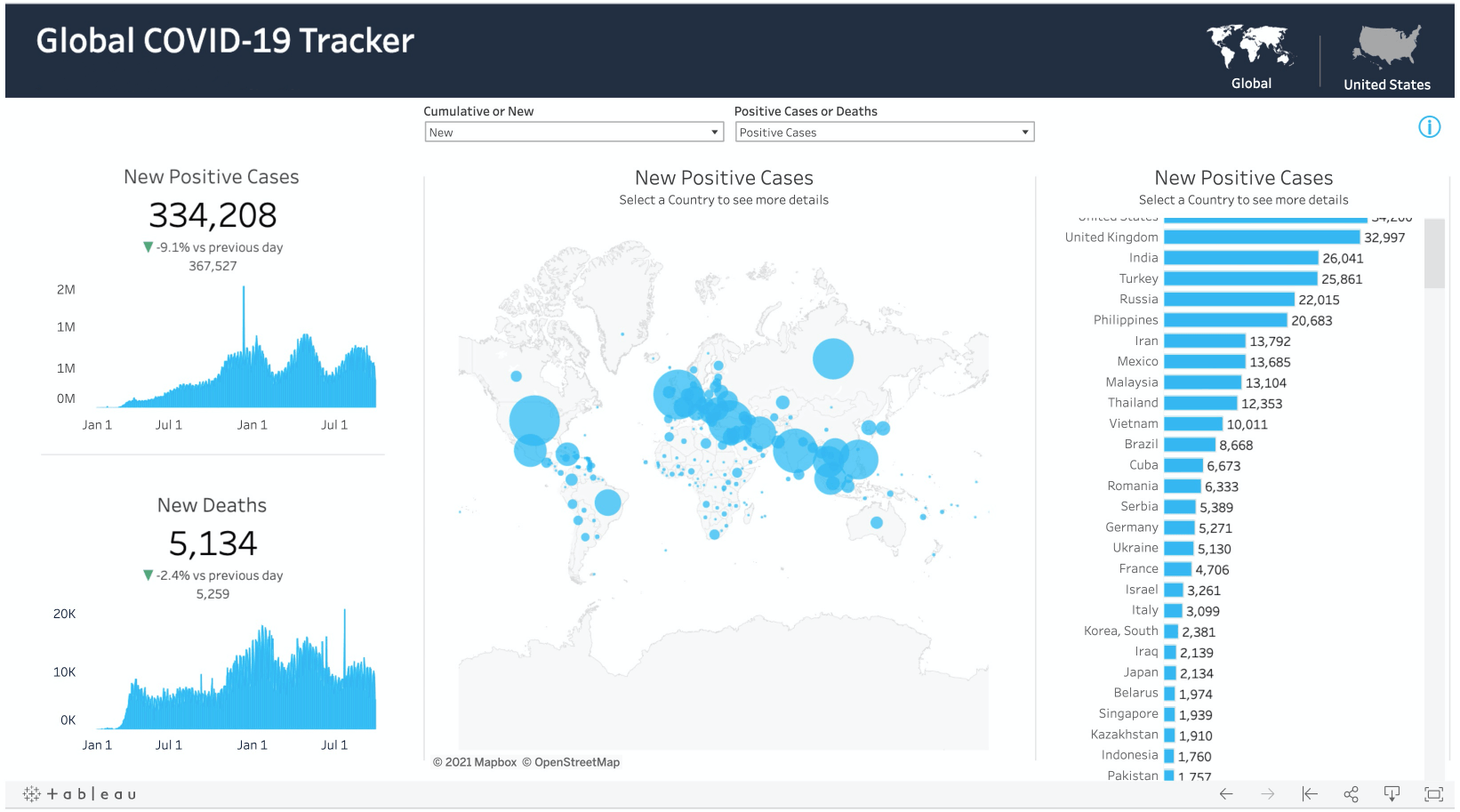
Tableau was one of the first to recognize that data was going to play a central role in helping people see and understand what was happening. Our team went to work right away and developed what was to be the first of a number of tracker dashboards to help visualize the scope of the pandemic. We launched the COVID-19 Data Hub in March 2020 as a free resource for people and organizations to access the tracker dashboard. The Global COVID-19 tracker provided key metrics on where the pandemic was spreading, and impacts, including metrics on mortality and hospitalizations. Within days of launch, the Hub had garnered thousands of visits. Over the course of the next year, millions of visitors to the site accessed the site, seeing critical metrics in near-real time, using the Global Tracker dashboard. The Tracker enabled everyone from business and public sector leaders, to the general public, to get the information necessary to make informed decisions. Visitors could also access and download datasets to perform their own analyses.
How data helped
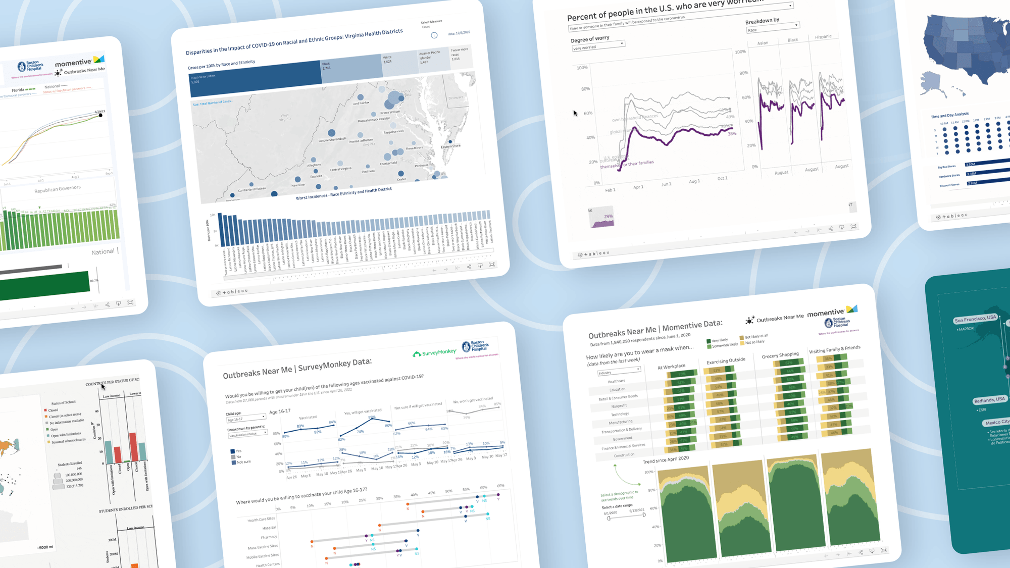
As the pandemic evolved, the Hub also evolved to offer thought leadership and a variety of content that addressed issues that were top-of-mind. Tapping into partners, subject matter experts, public health organizations, in addition to our own solution engineers, writers, and data leaders, Tableau stayed on top of the stories that mattered, and continued to be a valuable resource.
The power of data insights
From racial disparities to supply chain impacts, data was at the heart of every story we published. These data stories provided an essential perspective that helped visitors to the Hub gain more context about the crisis, and see the challenges on the path to normalcy.
The path to understanding begins with data
Our Global Tracker mirrored what was happening in each phase of the pandemic. At the onset of the pandemic, the dashboard focused on case and death rates. Once vaccinations became available, the tracker included vaccine roll-out and uptake data. The last iteration of the dashboard featured a total of nine distinct metrics that made it easy for visitors to get an easy-to-understand, near-real time snapshot of the current situation around the world.
Today, we find ourselves in a reshaped and reimagined world—due in large part to what we learned through data. The pandemic put a spotlight on why data is essential for navigating complexity, identifying risk, and seeing the progress towards recovery and a ‘new normal’.
After we launched the Hub, many other public and private organizations also began publishing dashboards that offer even more comprehensive analyses. For that reason, we’ve decided that it’s a good time to wind down our efforts, and re-purpose the Hub as an archive of our work. We hope these visualizations and stories inspire you to use data to look for answers, and gain new perspectives.
NOTE: This dashboard is no longer updated.
What we learned: Data in the time of of COVID-19
Pathway to a new normal
How people are thinking about work in a changed America.


The events of 2020 catalyzed a change in how people think about issues of community, equity, health, and wellness at work. On their path to a new way of life, people need easy access to data for a common understanding of what the future holds for themselves, their companies, and the economy. The data visualizations linked below survey results from a series of Momentive polls collected weekly representing more than 2 million people across the US.
Thank you to our partners


Tableau helps you see and understand your data
Organizations around the world are using Tableau to help navigate through the coronavirus pandemic and beyond. Find out how our platform can help your organization use data to stabilize, recover, and grow.