Tableau Community members connect a love for data and furry friends


How you become aware of amazing stories is often a question of coincidence. I was contacted after one of our Analytics Tableau User Group events by Tom Pierre, an attendee who entered the logo challenge. He talked about the wonderful work his team at Best Friends Animal Society does, and how they developed a Pet Life Saving Dashboard. Was this conversation coincidence?
As a pet lover myself, I contacted Laura Ward from the Tableau Community Team and asked if Tableau would be interested in showcasing the life-saving work of Best Friends Animal Society. When Laura proposed the idea that I write this blog, I was both terrified and over the moon because their purpose resonates with me.
From one pet lover to another, this article is about the connection and love we share for analytics and those adorable four-legged best friends.
Our shared passion for animals and data
What I learned about Best Friends
Apart from having an amazing logo that conveys the friendship between a pet and humans —which made me smile—I discovered that Best Friends has an incredible goal to save animals in their shelters by ending the killing of homeless pets in the United States by 2025. Best Friends has also been listed in Fast Company’s “World’s Most Innovative Companies” top ten list for 2021! Recognized for their use of data and the impact of the pet lifesaving dashboard, revolutionizing how we save the lives of cats and dogs around our country!
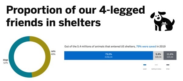
I don’t know how you feel about the two words “No Kill,” but they impact me so much. Here is the sad truth: Every year across the US, thousands of animals are sacrificed in shelters. Even though numbers have improved during the last three decades—from 17 million animals residing in shelters in 1984 to more than 600 thousand in 2019—the reality hurts and the numbers are too high!

Graph created in Tableau, data provided by Best Friends Animal Society
Thanks to Best Friends’ efforts, including raising awareness and educating the general public through data transparency, the national save rate is increasing. From 60 shelters in 2012 reaching a 90% no-kill to 2,000 in 2019, the work accomplished by Best Friends is admirable and moving the nation’s shelters towards achieving the desired no-kill status.
Graph created in Tableau, data provided by Best Friends Animal Society
Meet Best Friends’ Data Visualization team and the 2025 Goal Dashboard
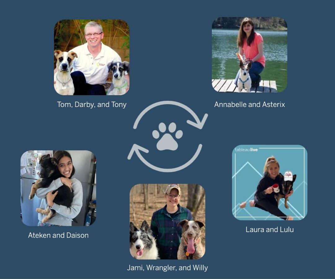
Jami Delagrange and Tom belong to the team responsible for creating and sharing the organization’s data visualizations, putting them very close to the cause and the solution. They admire and speak highly of each other’s work.
Jami is the manager of Visual Analytics and she joined Best Friends in 2016, around the time Tableau started being used. She discovered Best Friends by accident, and she now applies her technical skills on a daily basis towards a mission for which she has significant passion.
As she started her role, she fell in love with data visualization and paired that with her love for animals. She told me that she put all her energy into building the Pet Lifesaving Dashboard, and the results speak for themselves. You can genuinely see and feel her loves for what she does.
None of this would be possible without the amazing teamwork necessary to make sure the data stays fully integrated with Best Friends’ mission and core values.
The dashboard helps Best Friends with community engagement and awareness activity, and finding new homes for pets. It’s easy to use and allows people to explore data by state and by shelter, looking at the number of intakes, animals saved, and the shelter save rate.
Many teams across their partner network contribute to collecting, analyzing, presenting, and sharing information with individuals who can help their local shelters save more pets. And internally, two developers are dedicated to their Tableau project: Jami who builds the dashboard, and Tom who proceeds with the monthly maintenance and support to ensure things run smoothly.
Get Technical!
Jami confessed that the most challenging part is mastering “pixel perfect” in Tableau, which comes down to meticulous use of containers, padding, and a few design hacks to produce the cleanest experience for users. Text responsiveness and mobile design are also a challenge, but I have to admit that I really like the final work they did. I was puzzled when learning that the dashboard was developed before parameter actions were released (did I mention that they are my favorite feature), but Jami shared that they came up with the idea to add a navigation line to the design about two weeks before that feature launch. These details make all the difference!
Explore these specifics below:
- A sheet to create the aesthetic of the line
- Two sheets using circles to represent the active (black) and inactive (gray) dashboard interactions or current view, which can be repeated for all dashboards in the workbook. (Note: The use of shapes for basic elements rather than an image tends to render better on the Tableau Server.)
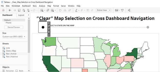
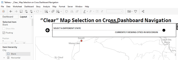
- Of course, the use of Parameter and Filter actions can help users return to the original view and remove the highlight from objects that were previously selected.
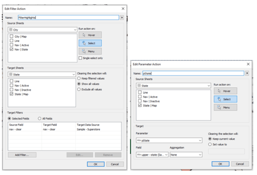
If you are interested in the techniques that Jami and Tom used, download a simplified version on Jami's Tableau Public profile.
What’s next?
Over the last five years, the team has improved their data practices and pushed their analytics skills forward with Tableau enhancements that hopefully result in the biggest possible impact that data can make on animal lifesaving, and helping Best Friends reach their No-Kill goal by 2025.
Historically, animal welfare hasn’t had the tools and standards to encourage transparency, but that’s shifting with greater willingness and ability to share data. More shelters are now reaching out to their communities for help using data-driven strategies, and the Best Friends team is influencing that change. The pet lifesaving dashboard has been a game-changer because of the clarity and understanding it brings.
Spoiler alert: On June 23, 2021, Best Friends launches a new user experience for its pet lifesaving dashboard, which displays the data clearly and further inspires community members through highlighting the areas of greatest need to help homeless pets in their communities.
Dear DataFam, we need you!
Help us raise awareness by making noise about this initiative and support the nearest shelter to find a loving match with your new Best Friend. But an animal gives their love forever; don’t take this responsibility lightly and disappoint the instant love they entrust to you.
Related Stories

Who are the CRM Analytics Ambassadors?
 November 30, 2023
Who are the Tableau Social Ambassadors?
 October 26, 2023

Who are the Tableau Academic Ambassadors?
 September 19, 2023
Subscribe to our blog
Get the latest Tableau updates in your inbox.