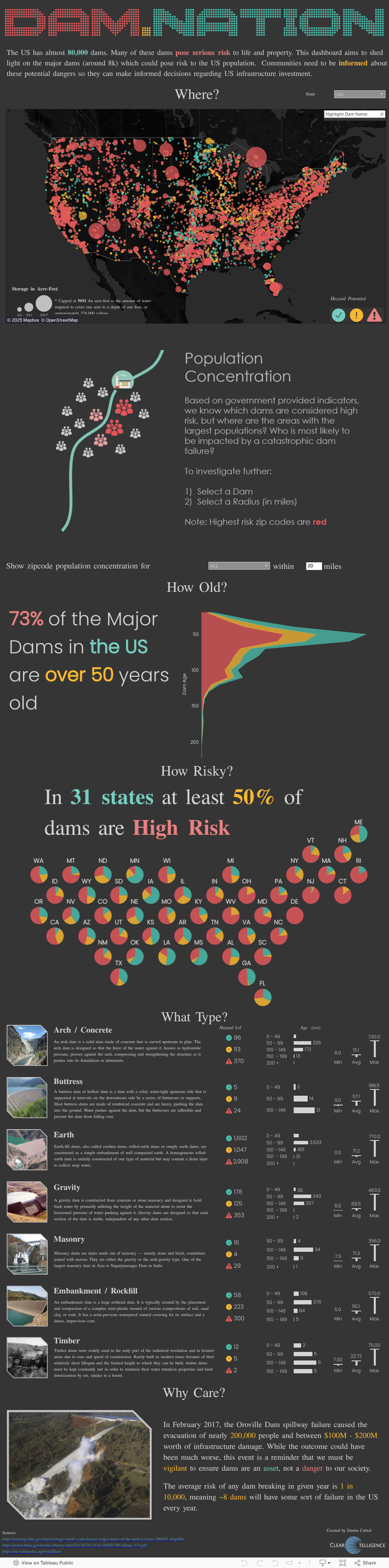
Dam Nation


Dustin Cabral is a prolific vizzer and blogger at DustyData, and his recent blog post on mapping dams in the US is used here with his permission.
In February 2017, the Oroville Dam spillway failure caused the evacuation of nearly 200,000 people and between $100M - $200M worth of infrastructure damage. This was my inspiration for my next dashboard, being a dad and a homeowner (and living near dams); I wanted to know if there was any potential risks posed by dams near my family.
My Process
- Find the data
- Dashboard Design
Finally, I started my dashboard design! I knew from the beginning that I wanted this dashboard to be BIG! There was so much information and so many ways that I could go with this data set that I wanted as much room as possible to work on this. I maxed out the dashboard height at 4000px first because Tableau is not so great at expanding dashboard size and leaving things in the same place as they were originally.
The first chart I made was the main map, as I knew this would be the centerpiece of the dashboard and the first thing that people would see/interact with. Hazard potential would end up being the key driver of the entire dashboard - impacting the theme, color scheme, and tone.
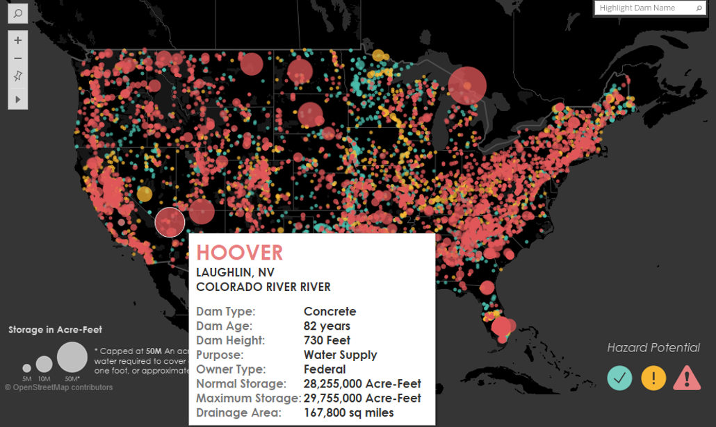
I decided to go with three main colors for the dashboard (relating back to the 3 hazard potential levels) and to make them pop I went with a dark dashboard (something I haven’t done in quite some time). For bubble size I went with “storage level”, which is measured in something called “Acre-Feet”. I had no idea what this was initially, but it turns out (thanks to wikipedia) that this is the amount of water to cover 1 acre of land in one foot of water (approx 326,000 gallons!). Actually, I ended up needing to throttle bubble size due to the dam at Lake Superior which had 9.7 BILLION Acre-Feet of storage (just an FYI, thats 3.1 TRILLION gallons of water). I made the cutoff 50M Acre-Feet, which looked good visually.
The next piece was a snappy title, which is hard to do in Tableau due to the limited amount of fonts available on Tableau Public’s servers. I turned to my trusty PowerPoint method of creating the text and saving it as a PNG to bring the title to life. Of course, I had to make a pun of the title (it was too much to resist!) and went with “Dam.Nation”.
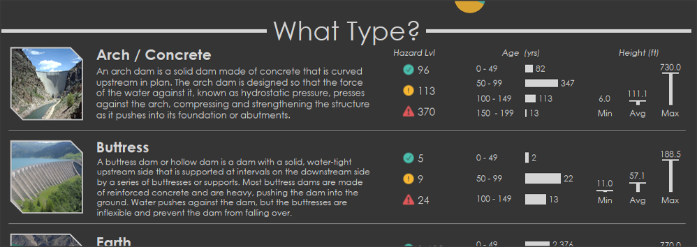
Since there was so much data that I wanted to show, I decided to break the dashboard up using grey borders with titles such as “How Old?” for the dam age section and “What Type?” for the section detailing different dam types. This helped give the dashboard an infographic type feel.

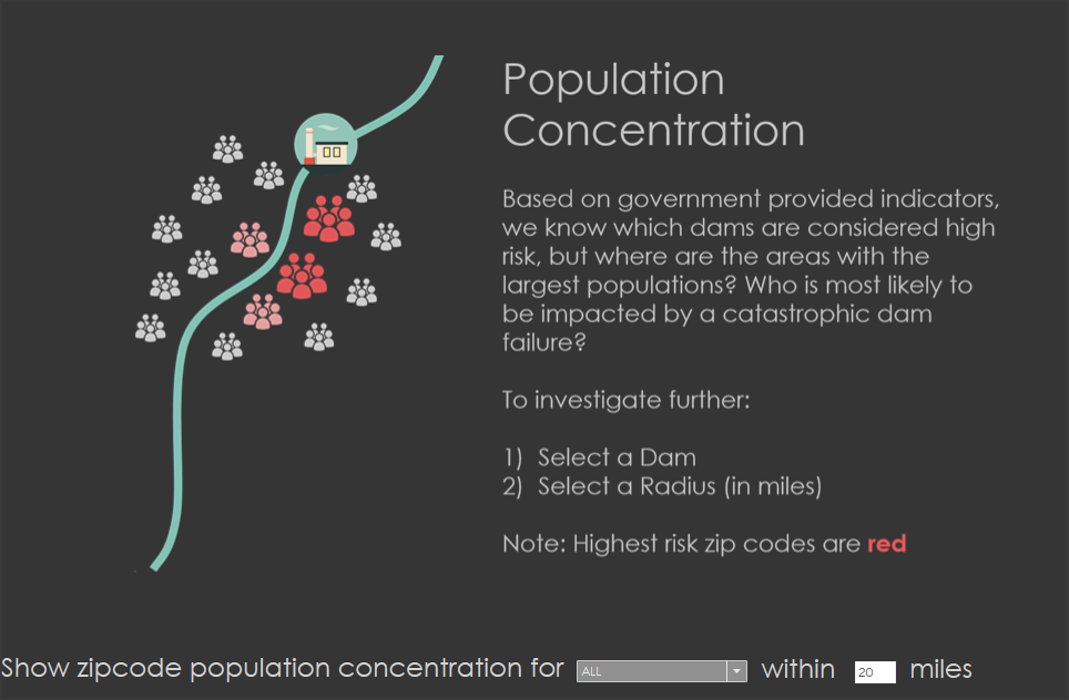
After completing most of the pieces, I still felt like I was missing a “wow” piece of functionality on the dashboard. What I personally wanted to know was “which dams around me pose the greatest risk?”. Now, this can be seen by zooming into your location on the map, but it was hard for me to tell just how many people were around the dam that could be impacted. So, I went through the Tableau forums to find a “radius” formula that I had seen before. There were a few different posts on this, but the easiest to replicate was from Zen Master Josh Milligan. His instructions were easy to follow and I quickly had a base for what I needed.
The next piece was finding population data and blending it into my visualization. I eventually found census data which had population by zip, which I unioned with the lat/lons of my dams. I added a Type to be able to filter out Dams on the zip portion of the map.
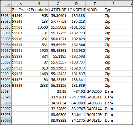
From here I created my view, which honestly took a bit of time and finagling. After a few tries, I got the blends to work right - turns out I had to bring the zip data in as fake dams in my other data set in order for this to cooperate correctly.
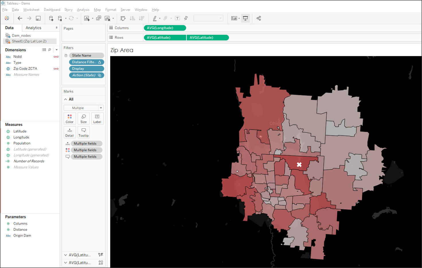
The last piece was to only have this map show up when I wanted it to. I used the old “parameter hiding” trick and made an image in PowerPoint to overlay on the dashboard, which doubled as instructions for the map!
And that was that! Phew….this dashboard did take some time to develop, but I think the end product turned out pretty well. Check out the dashboard on my profile for more details and feel free to download it to see how everything ticks!
As always, the hardest part by far (usually) is finding relevant data needed to create what you have dreamed up in your mind. The first spot I thought of was data.gov, as it is always a handy resource for federal/state level infrastructure data. After not too long (wow that’s a first!) I found a good data set!
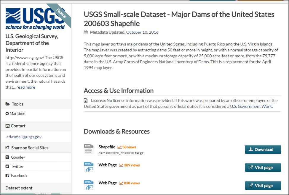
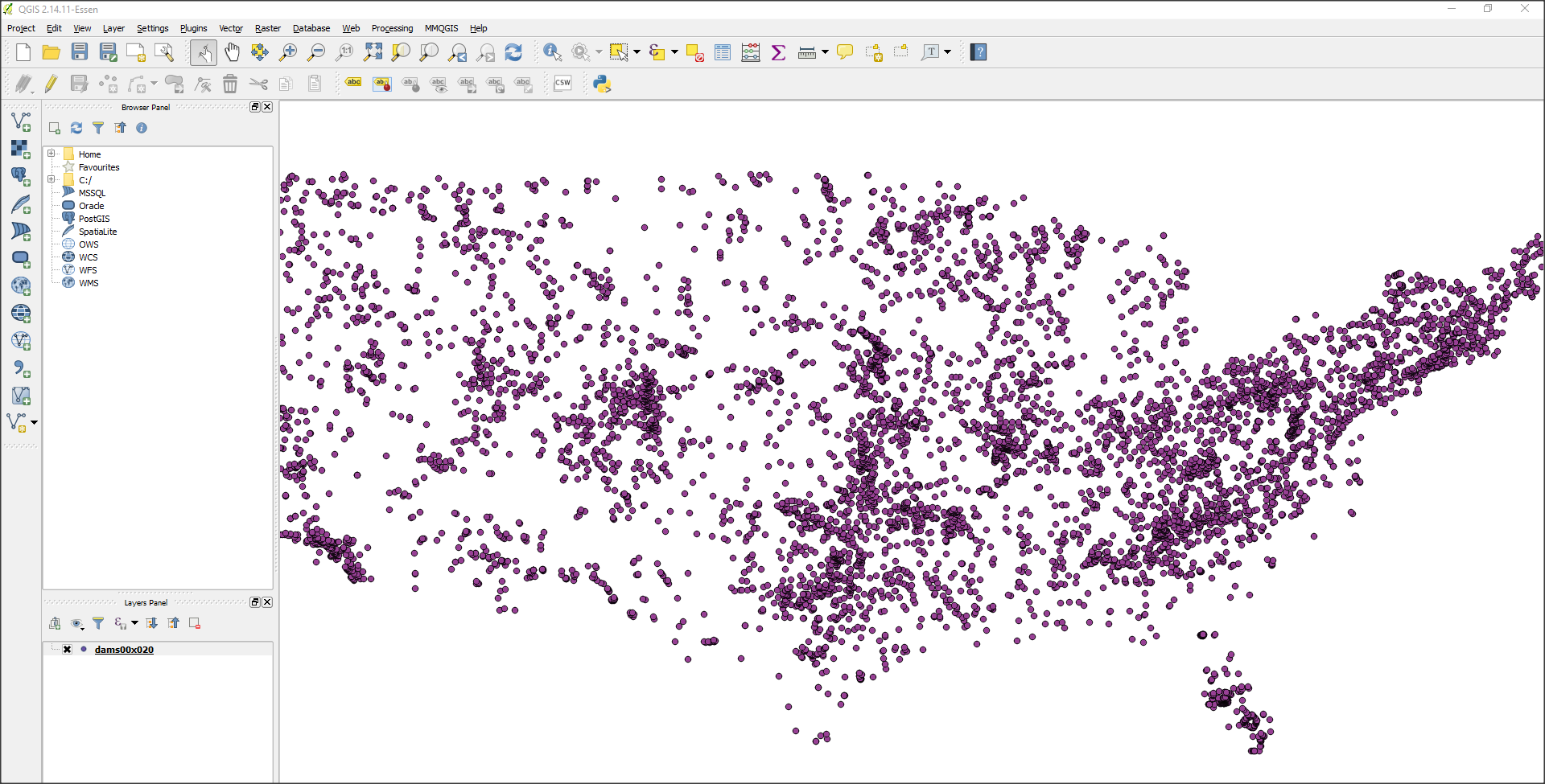
BUT, I saw that this data was in a shapefile, which (at the time, just before the 10.2 release) could not be directly imported into Tableau. Not to be deterred, I went to the google machine to figure it out. What I found was a new tool that I would add to my handy “Tableau Toolkit” called QGIS. QGIS, turns out, is a free open source GIS tool that can do all sorts of neat geo-spatial editing. What I ended up needing it for in this case was to push the shape file out as a .CSV.

To convert the file, I followed the steps outlined on the 10.1 help site. Like I mentioned before, 10.2 makes this process easier BUT Qgis is still an excellent tool and 10.2 hasn’t solved for multiline shapefiles as of now (so basically you should still learn this tool).
Once the data was exported to CSV I took a look at it to get my bearings. It looks relatively simple with data like dam height, year built, etc. There were some codes that I didn’t recognize however, like hazard level. For this I went online again and found a useful resource on the FEMA website which listed out hazard levels and a few other missing pieces which I needed detail / alias names for.

Related Stories

Meet Iron Viz 2024 Finalist Jessica Moon
 April 15, 2024

Meet Iron Viz 2024 Finalist Pata Gogová
April 8, 2024

Student to BI Analyst, How Tableau Can Lead to a Successful Data Career
 March 20, 2024
Subscribe to our blog
Get the latest Tableau updates in your inbox.