#MyRecentViz: How Many Days a Year Is China’s Air Safe to Breathe?


Editor’s note: This blog post is co-written by Yueqi Yang, who is a M.A. student in the Business and Economic Reporting program at NYU Journalism School, and by Florian Ramseger, Product Specialist at Tableau. Yueqi covered the 2017 World Economic Forum in Davos as a reporter for Pro Journo. As part of that assignment she wrote about air quality in Chinese cities. Here we take a look at the data visualization that was used as exhibit A in that piece.
The Question(s)
The Chinese are quite concerned with their local Air Quality Indices or AQIs, checking them real-time on apps. Schools cancel classes based on the indices readings. Parents use it to decide if it’s safe to let their children play outdoors. Extreme readings often make headlines in the daily news.
What Yueqi wanted to find out is: How many days a year is the situation so bad in China that air pollution becomes a health hazard and affects everyday life in such drastic ways?
Secondary questions were: Is it true that air pollution is on the increase in China? And how does air pollution vary over time and geography?
The Viz
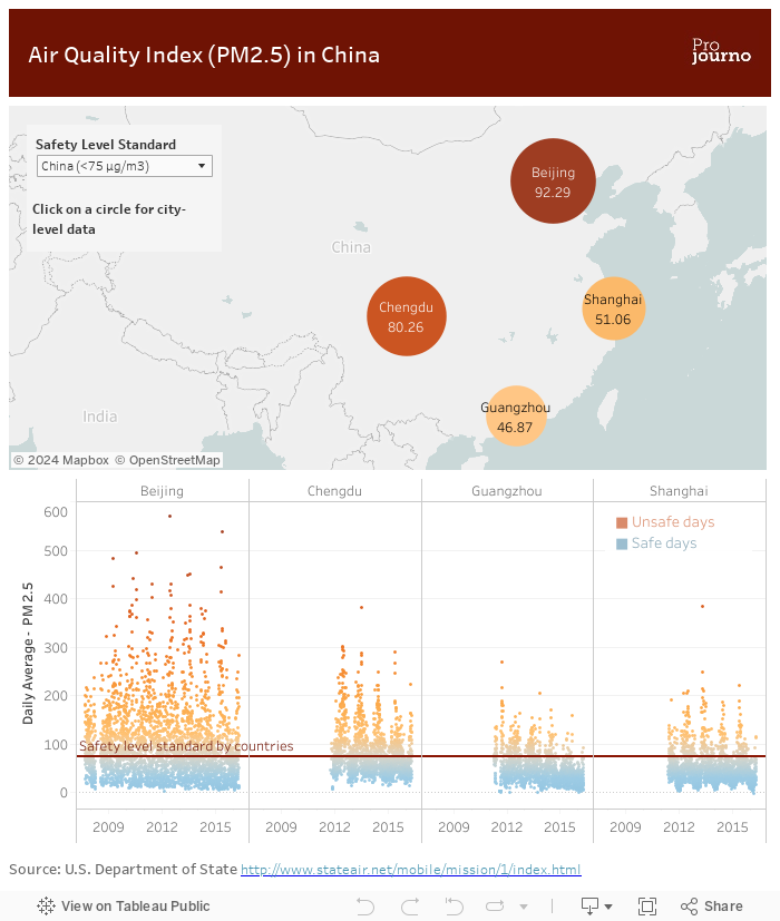
On a map we show the four major cities of China and their average PM2.5 readings—the amount of particulate matter, 2.5 micrometers or less in size, measured in µg per cubic meter of air. The higher this number, the more health-threatening pollutants are in the air. Clicking on a city will give the evolution of this metric over time for that city in the chart below.
The dot plot—the main chart of the visualization—shows how far pollution in four major Chinese cities gets above levels considered safe.
The viz allows you to adjust the “safety level standard” based on different countries’ criteria. The Chinese government defines the safe limit of the pollutant as 75 µg/m³ — much higher than the US level, which is 35 µg/m³ and Australia’s even stricter level of 25 µg/m³.
The Answer(s)
So according to the air quality data, how many days in a year is the air unsafe to breathe? The answer: It depends on the definition of safe air.
As a result, in 2015, according to the US air quality standards, Beijing was unsafe 62.5% of the time, compared to just 37.7% of the time under the local standard. The viz shows that the number of orange dots, representing dangerous days, significantly rises when you switch to the US standard from the Chinese standard.
When zooming in on one city, by clicking on the cities in the map, the dot plot also reveals interesting seasonal variation in the data, with winter month showing worse readings than summer months.
Contrary to popular belief, the viz also shows that air quality has actually improved from 2014 to 2015 when considering the overall trend. The slowdown in heavy industry in China and tighter government control over air quality were contributing factors. But as the manufacturing and energy industry picked up in late 2016, air quality deteriorated again.
In curbing the air pollution, the government faces a trade-off in terms of curtailing productivity and economic growth. But it has already shown some willingness to do so, initially during grandstanding occasions — shutting down 10,000 factories and 9,000 construction sites in Beijing during a military parade for instance. But in recent years, it has extended similar closures for months in some regions. The effects can be seen in the data.
The viz also highlights the marked differences in air quality between inland and coastal cities. Smog is more severe in Beijing than in Shanghai and Guangzhou, because of the capital city’s proximity to inland coal plants and farmers burning coal to heat their homes. On the worst day in 2015, the PM2.5 reached 722 µg/m³, exceeding the US safety limit by almost 20 times.
The Data
We used air quality data from the American Missions in China. The US embassy in Beijing was the first to publish air quality data back in 2008. The indices monitor the density of one of the most dangerous air pollutants, PM2.5. Less than 2.5 microns in diameter, these airborne particles are able to penetrate the human respiratory system and even enter the bloodstream. Today, the data is also recorded by US consulates in Shanghai, Chengdu, and Guangzhou.
The Chinese government initially denounced the US monitoring program, calling it illegal. But under pressure, the Chinese government has now installed its own monitors nationwide and publishes its own Air Quality Indices data based on PM2.5 levels.
We downloaded the all data collected by the US Missions. Then we unioned the individual files—there is one file for each city and year—to get one single data table in Tableau (Watch tutorial #8 on this page to learn more about merging data files in Tableau).
The Chart(s)
Initially we started out with line charts to show the evolution of the PM2.5 readings over time. After some playing around, we settled on a dot plot instead. This has the advantage of making it clearer that each data point above the line is a day where the citizens of these cities are negatively impacted by bad air quality. Coincidentally it also provides a nice visual reference to the suspended particular matter that we are analyzing.
We used a parameter that captures user input to choose a safety level. A reference line is drawn to show the selected safety level across the chart. (Read this help page on how to set up such a parameter-controlled reference line.)
A calculated field provides the distance of the PM2.5 reading from this safety level. This was then used to color the dots: those where the distance is positive are bright red. The ones with a negative distance—those below the line—are blue.
The map was intended as an entry point into the data, and with the large circles also makes it easy to filter the dot chart on a mobile device.
The Design
The layout is a classic two chart-dashboard, where we utilized some of the empty space on the map to place the parameter menu and instruction for the user.
We used a mobile layout to tweak the layout for smaller screens, preventing the title from overlapping with the Pro Journo logo.
In terms of the colors, we started with Pro Journo ’s dark red, and looked for some complimentary colors. We used shades with a low saturation, appropriate for dirty air, we thought.
Closing Thoughts
One other thing we were trying to do, but didn’t implement in the end, is to get Tableau to output percentages, showing how many days a year are above the threshold. However, with the data being hourly readings, we got lost in the details of the calculations. If anybody figures this out, we would be very grateful for any tips, or any other feedback you might have on this viz. You can reach us on Twitter: @Yueqi_Yang & @FRamseger.
Related Stories

Meet Iron Viz 2024 Finalist Jessica Moon
 April 15, 2024

Meet Iron Viz 2024 Finalist Pata Gogová
April 8, 2024

Student to BI Analyst, How Tableau Can Lead to a Successful Data Career
 March 20, 2024
Subscribe to our blog
Get the latest Tableau updates in your inbox.