Unleash Your Creativity with Tableau Public


The following is a guest post by Fanalytics speaker Jacob Olsufka.
For my Fanalytics talk, I decided to focus on the process that drives most of my Tableau Public vizzes, the process that I find so enjoyable and the reason why I love my job.
As a business intelligence consultant, I use Tableau just about every day. For me, Tableau Public is my outlet through which I get to express my creativity, try out new and innovative approaches, and stretch the product to see what it can do. Staying active by creating vizzes in my free time has not only been fun but also made me even more prepared in my job to handle all the different challenges that get thrown my way.
It is a very rewarding process to begin with an idea, then bring that idea to life through data collection, exploration, preparation, and visualization. Fitting those pieces of the puzzle together is what I enjoy most about data analytics. I love using rich data sets, which allow for entertaining, engaging, relatable, and creative visualizations.
As a disclaimer, I also love baseball, so as you will see, much of my work is related to that passion of mine. Since baseball is such a stat-driven sport, being a baseball nerd and data nerd together has proven to be a good combo.
Stretching the Product
One of the greatest parts of actively following the Tableau community is being inspired by the various ways people creatively stretch the product. I love showing people a dashboard and seeing the reaction that they can’t believe it was made in Tableau. A great example of this is my Ballparks of the MLB viz.
There is a popular infographic designed by Lou Spirito that I had seen and found very interesting. It shows MLB ballparks’ fence dimensions overlaid so you can see how each stadium has its own unique features, sizes, and fence heights. I ran across a reddit post linking to it, with the top comment saying, "This would be really cool if it were interactive, in that when you scroll over a park on the right, it highlights the outline on the left.”

Immediately a light when off in my head, thinking, I can do that in Tableau! I was determined to make this idea a reality because I knew (as the user community has demonstrated time and time again) if you put your mind to it, you can find a way to do it in Tableau.
After a combination of Illustrator to get the coordinates, Alteryx to prep the data, and Photoshop to make custom background maps, it all came together just how I wanted in Tableau.
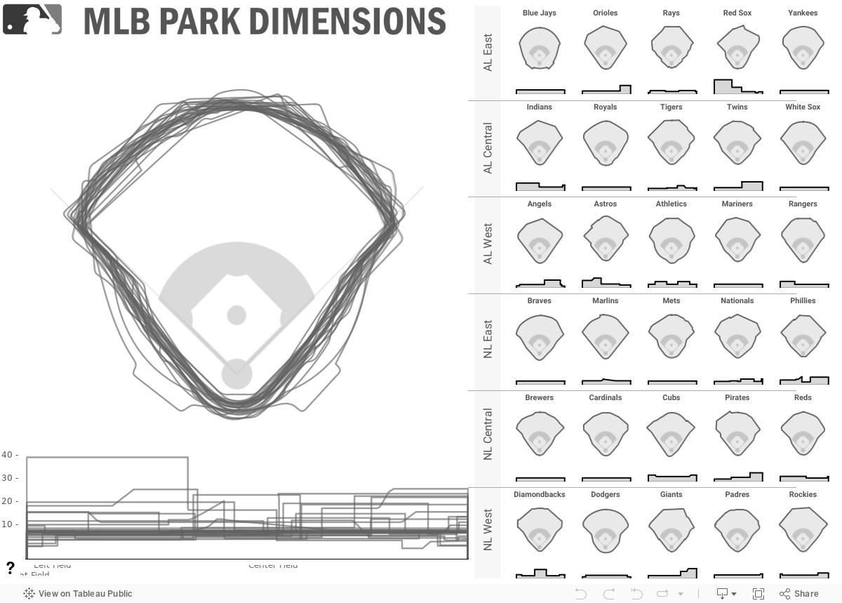
**Here is a great tutorial that I followed to extract the coordinates from a polygon using Adobe Illustrator. This is how I mapped each stadium’s outline as a custom polygon so that they each function as their own path.
MLB Analytics
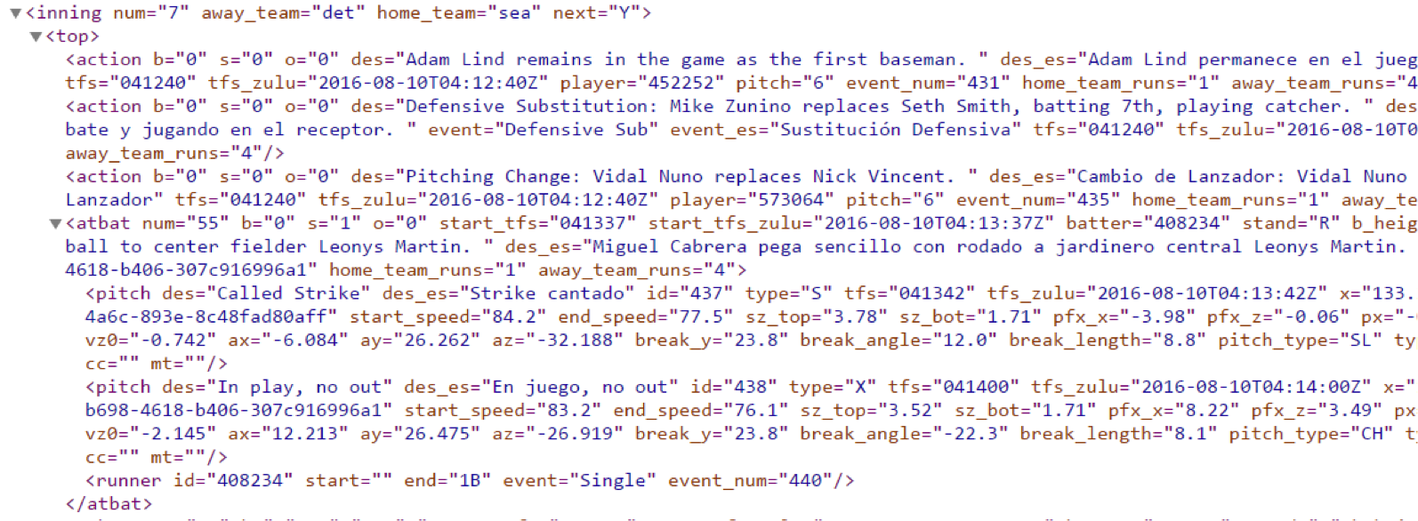
When you follow a MLB game on your phone, on MLB.com, or look at box scores after the game to see how your favorite players did, the data that powers those is all stored in a well-organized file structure by the MLB and made publicly available. It is known as MLB gameday data, and each game has many different XML and JSON data files associated with them, describing the games and events in them in a variety of ways.
I have spent the last couple of years playing around with ways to analyze this data, but it wasn’t until recently that I truly unlocked its potential. The most granular file is one that includes PITCHf/x data collected by sophisticated pitch-tracking cameras. Each pitch since 2008 has around 20 metrics describing it, from pitch speed to pitch type, to the location where it crossed the strike zone. Here's an example of what this data looks like:
With the help of several members of our data team at Decisive Data (special thanks to Darren Gardner), we loaded the data into Snowflake, a cloud-based data warehouse that excels at querying semi-structured data (like XML and JSON).
Once we loaded in the past eight years of data, Snowflake provided quick and easy access to the files and data with which I could conduct ad hoc analysis. The MLB data warehouse that we created has 32,000 games, two million at-bats, and seven million pitches—my dream come true!
Several of my favorite vizzes that I have designed using this data are:
- Pitcher heatmap showing pitch-location tendencies of pitchers
- Home-run tracker dashboard, which allows you to see where each home run landed along with the corresponding pitch data. Each home run includes a link to its video on MLB.com!
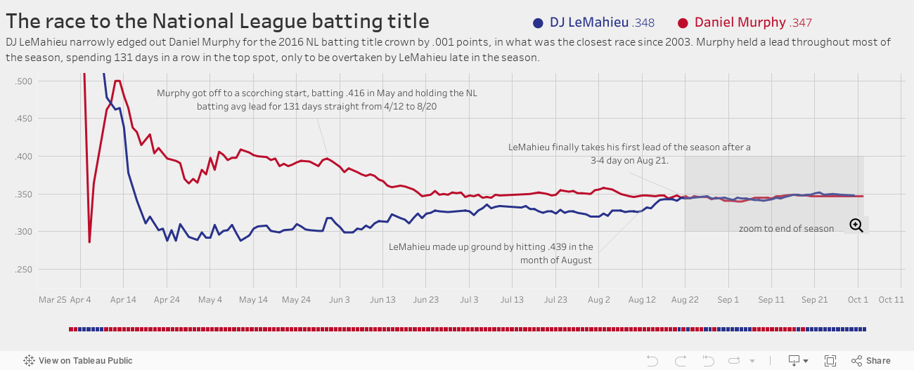
- A simple viz narrating the story of the season-long battle for the NL batting title (seen below)
Stay tuned for more MLB work, including dashboards on team’s attendance trying to determine which teams have the most fair-weathered fans and analyzing if umpires have specific biases in the way that they call balls and strikes.
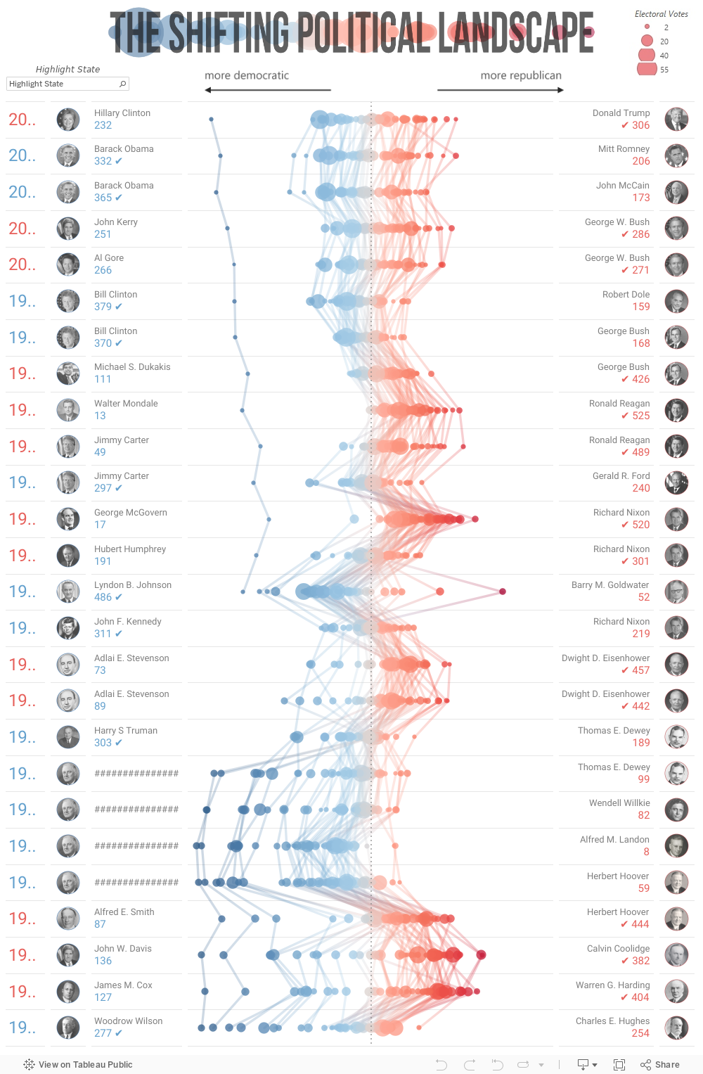
Election Season
Being that the Tableau Conference took place during election week, I had to talk a little bit about the election. Earlier in the year, I created several vizzes around historical election results, two of which were featured as Viz of the Day. I enjoy analyzing election results because the data is very rich in nature, with so many different stories to tell and ways to tell them. Once the election results had finalized, I updated all my vizzes with the newest data. Check them out on my profile page. Here is the finalized published version of the new viz that I previewed during my presentation:
For more tips, tricks, and ideas by Jacob, check out his Tableau Public profile page. You can also connect with him on Twitter @j_olsjfka.
Related Stories

Meet Iron Viz 2024 Finalist Jessica Moon
 April 15, 2024

Meet Iron Viz 2024 Finalist Pata Gogová
April 8, 2024

Student to BI Analyst, How Tableau Can Lead to a Successful Data Career
 March 20, 2024
Subscribe to our blog
Get the latest Tableau updates in your inbox.