Couch to Iron Viz: Prepare for the ultimate data viz competition with this training guide


It’s that time of year again. We’re gearing up for Iron Viz and it’s time to start sharpening your skills for the ultimate data showdown. For those who don’t know, Iron Viz is a data visualization competition comprised of a series of qualifier contests—each with a different open theme. The winners advance to a final, live competition at either Tableau Conference or Tableau Conference Europe.
Iron Viz can be intimidating, but it doesn’t have to be. Even if competing on stage isn’t your ultimate goal, participating in the qualifier rounds provides an excellent opportunity to flex your data visualization skills and build your "live portfolio" on Tableau Public in the process. Preparing for Iron Viz can be a lot like preparing for a big race. It requires both mental and physical training, but in the end, it’s both rewarding and a lot of fun.
To gather some pro tips, I interviewed Iron Viz alumni Timothy Vermeiren (2018 champion, Tableau Conference) and Sarah Bartlett (2018 finalist, TC Europe) about their go-to resources for advancing their data viz skills in the categories of design, storytelling, and analysis. Here’s your guide for excelling in your Iron Viz journey, right out of the gate:
Feed your mind with these data viz books
Books are a great place to learn more about data visualization theory, history, and best practices. Both Timothy and Sarah cited books as one of their favorite resources for building their knowledge of data visualization. To start, peruse this list of data visualization books or explore some of Sarah and Timothy’s favorite titles:
- The Functional Art and The Truthful Art by Alberto Cairo: “Alberto Cairo’s books are really useful for learning the principles of design, which is an essential skill in the world of data visualization.” —Sarah Bartlett
- Storytelling with Data by Cole Nussbaumer Knaflic: “The name says it all, really. But the resources on her blog and in her book are excellent examples of storytelling.” —Sarah Bartlett
“Cole’s book focuses on how to ‘make data a pivotal point in your story’ and manages to clarify and teach the topic in different contexts and for different types of communication.” —Timothy Vermeiren
- Dear Data by Giorgia Lupi and Stefanie Posavec: “Dear Data describes and depicts a year of weekly communication between the authors. These communications consist of strictly hand-drawn data visualizations on postcards they sent to each other on various day-to-day topics: decisions, complaints, laughter, greetings...you name it. Each postcard tells a story that I thought was captivating to understand and envision.” —Timothy Vermeiren
- The Big Book of Dashboards by Steve Wexler, Jeffrey Shaffer, and Andy Cotgreave: “Steve Wexler, Jeffrey Shaffer, and Andy Cotgreave have pulled together 28 business-related dashboards, highlighting both good and the bad functional design. They discuss how and why they were designed in a certain way, teaching the reader all about why the design's functionality is suitable for each real-world scenario.” —Timothy Vermeiren
Flex your data viz muscles with community challenges
Sarah suggested participating in community challenges throughout the year to keep your skills sharp and prepare you for a competition format. There are an abundance of data visualization challenges on the web, but these are some of her highlights:
- Storytelling with Data Challenge: “Author of the book with the same name, Cole Nussbaumer Knaflic, has a Storytelling With Data Challenge every month. Each month has a different topic and participants have a week to find data, create and share their visual, and add commentary. The most recent challenge was to create a viz that shows variance. But because of what she does, she wants you to focus on that storytelling aspect as well. She also provides feedback when you use the hashtag #swdchallenge.”
—Sarah Bartlett - IronQuest: “Currently it can be quite daunting for people entering an Iron Viz qualifiers for the first time. The goal of IronQuest is to help participants become more comfortable with sourcing their own data and visualizing a specific theme through participation and, hopefully, they will be more likely to enter the main Iron Viz competition once the qualifiers are open.” —Sarah Bartlett
- Makeover Monday and Workout Wednesday: “Both Makeover Monday and Workout Wednesday are great community resources. Just by looking at what other people are doing, and seeing how they draw out the story is a powerful way to learn. Participating in projects like this will help prepare, not just for the analysis portion, but also for the design and storytelling aspects of the Iron Viz competition.”
—Sarah Bartlett
Set your pace with examples of analysis, storytelling, and design
Struggling with blank canvas syndrome? It can be helpful to use examples as a guide. Look to the Tableau community galleries, including a list of past Iron Viz winners, or other competitions like Information is Beautiful. Here are some places to start:
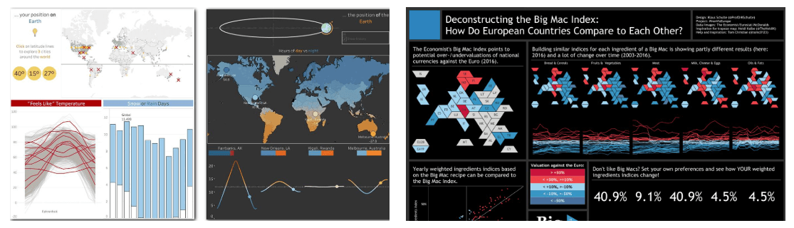
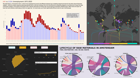
- Viz Gallery of past winners: “Look to past winners for inspiration. Some of my favorite Iron Viz visualizations came from Shine Pulikathara and Corey Jones. Shine Pulikathara's work in the 2015 Iron Viz final resonated enormously with me. The story he told is well-structured and he starts it from a personal perspective. Immediately, the emotional value becomes apparent. Corey Jones' entry for the 2018 Iron Viz feeder contest on Health and Well-being titled "Finding Oases in Food Deserts" reads like a story and displays its typical structure with an introduction, a (highly visual and interactive) body, and a conclusion. The call to action at the end is a very clear, actionable suggestion.” —Timothy Vermeiren
- Data Beats Project: “Rob Radburn and Chris Love weave their analytical findings into the narrative, just like you see in data journalism. And they tell a story with complimentary bite-size charts and visuals.” —Sarah Bartlett
- Kantar Information is Beautiful Awards: “You can look at previous nominees and get an idea of what they've perceived as good design. They bring in content from all over, including journalism articles. Some of the visualizations are just incredible.” —Sarah Bartlett
Stay in shape with tips from Tableau blogs
Blogs offer digestible bursts of knowledge from brilliant professionals in the data viz and analysis fields. When it comes to data viz blogs, Timothy shared: “This is something that the Tableau community excels at! There are an abundant number of blogs published by people of all skill levels, including absolute beginners, depicting their Tableau journey.”
For a rotating list of Tableau bloggers, check out the monthly Best of the Tableau Web on the Tableau blog. Timothy also suggests checking out this list of 2018 visualization lists “for design inspiration in its aesthetic sense.”
Explore the Iron Viz webpage for more information about the competition, including official rules, a schedule of Iron Viz qualifier contests, and a gallery of winning vizzes.
Related Stories

Meet Iron Viz 2024 Finalist Jessica Moon
 April 15, 2024
DataFam Roundup: April 8–12, 2024
 April 12, 2024

Meet Iron Viz 2024 Finalist Pata Gogová
April 8, 2024
Subscribe to our blog
Get the latest Tableau updates in your inbox.