New in Tableau: Beautiful dashboards down to the last pixel with formatting improvements


When presenting your insights, we understand that every detail matters. Once you’ve analyzed your data and found new insights, making those insights look clean and professional should be a piece of cake.
With the newest release of Tableau (2018.2), we’ve made some exciting dashboard formatting improvements. Gone are the days when you go to put the finishing touches on your Tableau dashboard only to struggle to make filters or worksheets line up just right, or when you publish to Tableau Server only to find out that your dashboard design doesn’t show up right on your phone.
Here are the dashboard formatting advancements in Tableau 2018.2 that will save you time and make formatting just as enjoyable as the analysis itself.
Dashboard grids
Dashboard grids have already proven to save me time (and sanity) when it comes to aligning objects on my dashboard. With a quick toggle, I can display a grid underneath my dashboard that helps me ensure that each of my floating filters and legends sit right where I want them. Additionally, I can use my keyboard arrows to nudge them a pixel to the left or right (and if I need to, even increase the size by a pixel at a time).

The community has been asking for this feature for awhile now (shoutout to Kelly Martin)—and we’re so excited to deliver it. For all you Tableau Public authors out there, your life just got a lot easier!
Automatic mobile layouts
Have you ever sent someone a link to a published dashboard and they pull it up on their phone or iPad—and only then do you realize that you forgot to optimize the dashboard for mobile?
Tableau Desktop is now smart enough to make a recommendation for laying out your dashboard for a given screen size or device, so you don’t have to spend a lot of time cleaning it up.
You still have the ability to update the dashboard layout, but you don’t have to worry about floating legends covering up important insights on a given view.

Notice the filter was moved to the top of the dashboard, and the legend was moved right below the view that uses that legend.
These two formatting features will make a big difference when conveying insights to others.
Learn more about the features in this release and download the latest version of Tableau.
Related Stories
Keep Payment and Cardholder Data Secure with PCI-DSS Compliance for Tableau Cloud
 July 10, 2025
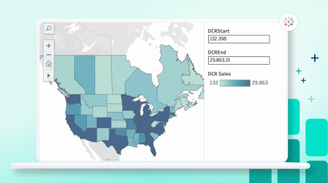
Dynamic Color Ranges in Tableau: Clearer Visual Analysis
 June 21, 2025