If I were new to Tableau again: 3 things no one told me


Note: The following is a guest post by Tableau Social Ambassador Bridget Winds Cogley.
Some people write posts about things they’d tell their younger self. I wouldn’t have listened, and neither would have they. We know this. How? Because other people DID tell them. And no one listened. Maybe it was your grandma, maybe your mother, maybe some other person (random dude on the corner, old boss, you pick it). It was said before, that I promise you.
But on to the point. I started out with Tableau before my area had a user group. Don’t get excited: We were really far behind. Seriously, like our airport, nothing exciting happens in Columbus, or C-bus. BUT, we’re C-bus. We have buckeyes. And Cow Town Pizza. And concrete corn. And now the John Glenn Airport in Columbus.

And we walk through fields of (concrete) corn…
So, if I were new to Tableau again, what would I want to hear (again)?
Tableau was created differently
Sometime over 13 years ago, Chris Stolte turned his Ph.D thesis, a small undertaking called the Polaris formalism, into a business with his thesis advisor, Pat Haranhan, and Christian Chabot, a friend who drove around in a Geo Prizm to sell it (very 2003).
Chris Stolte wanted to make understanding data natural, you know, like how the human head works. He took ideas from PowerPivot and made something that liked relational data, not just cubes, and focused on charts.
Full stop here: 13 years ago, cubes were all the rage, as were cell phones from Nokia. You know, the ones with nine buttons on the front and screens smaller than your LinkedIn picture. But someone looked at the Rubik's Cube and wondered what was inside. That’s what happened with Tableau and data analysis.
Rather than type out long queries or fight to make information visual, Chris worked to make it accessible. The magic is shown below.
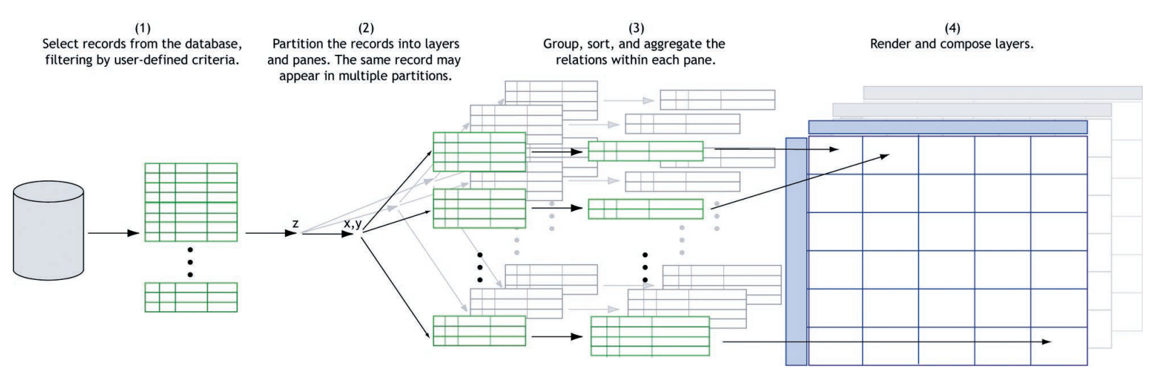
Tableau runs on VizQL. And VizQL is a language—yes, like SQL is a language—that follows a visual syntax. It’s powered by dragging and dropping, but it’s not just dragging and dropping. No, each item—the Marks card, the rows, the columns—all have grammar, and that grammar translates to the source. As a linguistics nerd, this is mind-blowing to me.
Tableau has evolved differently
Just like other languages, Tableau has evolved. It’s called the diachronic process. Some people say it’s just a program maturing, like any other software. But look at how visualizations change. Look at how that change evolves over time.
I got permission to pick on former Iron Viz champ Ryan Sleeper this time. Send him kudos for his bravery (and well as props for some stellar vizzes).
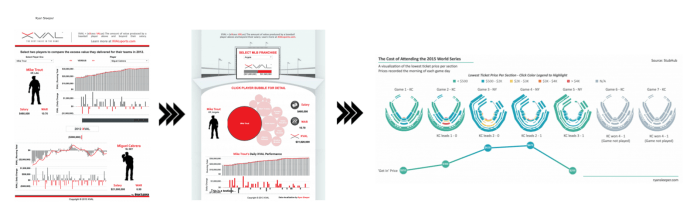
If we look, we can see his style progressively evolve (go look at his vizzes to get the full picture). And, of course, he moves toward one of my favorite colors! What’s not to love?
Now, this isn’t just integration of new features. In fact, there’s a lot that’s custom and not feature-related. These are things like color, placement, integration of art for fonts, shapes, and the like.
So if this evolution isn’t just product related, then what’s driving it? It’s how we communicate that’s changed. It’s not just fads in design, but usage and maturation of language. You know, how we tell stories in the first place.
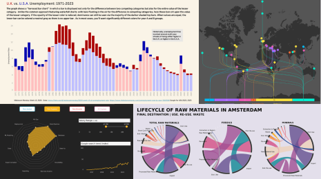
Tableau is dramatically different—as in dramatic pictures
We see from the above that Tableau is a visual tool. As we move from the ideas of tables and rigid constructs that stem from Excel, SQL, or wizards, we get to understand the world in a different light. Bilinguals, you get this already: Sometimes the perfect word for a concept exists, but it’s in a different language.
For anyone who can read a character-based language (more politely called logographic systems by language nerds), you have additional insight into the difference that makes. And, my far-and-few-between signers, you get it the most.
Let’s take a quick detour here. Paragraph for paragraph or concept for concept, most languages convey information at around the same right rate. Spanish speakers, for example, may use more words (I blame all the articles), but their rate of speech is also generally faster than English speakers, so their rates of concept-to-speed end up about the same.
Guess what: Sign languages and spoken languages also run the same speed, except in one area, describing spaces and places. Harlan Lane tested this and many sign-language users can attest: Spatial descriptions in sign languages go farther, faster.
Tableau is like American Sign Language for data analysis and visualization. It was designed for humans looking to understand information. It takes its queries (you lucky people at #data16 in London have some explainin’ to do) and puts them into a visual form, which then translates back to either Tableau’s in-memory storage or the original source. This is game-changing for those of us who have spent years saying, "If I could just…" Guess what? Now you can.
You’ve read this. You’ve been told. But two to five years down the road, I expect you to write something similar. Because Michael Cristiani knows I did, and he’s the one who tried to tell me this before.
For more tips, tricks, and vizzes by Bridget, check out her Tableau Public page and her blog, TableauFit. You can also connect with her on Twitter @windscogley.
Related Stories

Meet Iron Viz 2024 Finalist Jessica Moon
 April 15, 2024
DataFam Roundup: April 8–12, 2024
 April 12, 2024

Meet Iron Viz 2024 Finalist Pata Gogová
April 8, 2024
Subscribe to our blog
Get the latest Tableau updates in your inbox.