Election viz gallery: Exploring the data stories behind the races


You've heard from the candidates—but what does the data say? We're curating a gallery of vizzes to find out!
Join us as we explore the data stories about all things US elections. See how the presidential candidates stack up, how the country's political divide has changed over the years, and how past presidents fared in approval ratings. Check out our gallery, which includes a number of vizzes by you, our community. And do check back as we'll continue to update the gallery through Election Day.
Here are a few highlights to get you started.
Poll numbers: How the candidates stack up
What do the polls say? It depends on which source you ask, and on which day. As Adam Crahen shows in this mobile-friendly viz, polls vary widely even on the same day and don't always favor the same candidate.
On Sept. 21, for example, the NBC News/Wall Street Journal poll favored Clinton by six points while the LA Times/USC Tracking poll favored Trump by four points. (Side note: Adam used Tableau's new Google Sheets connector to build this poll tracker, which refreshes daily.)

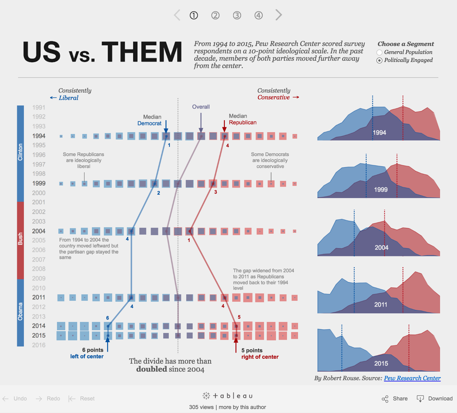
The growing political divide
In recent years, the political divide between Democrats and Republicans has doubled, as this viz by Robert Rouse shows. Robert visualized the Pew Research Center's survey data, which shows that members of both parties have moved away from center in recent years. Click on #2 to compute your own ideological score and see how you stack up against the survey respondents.
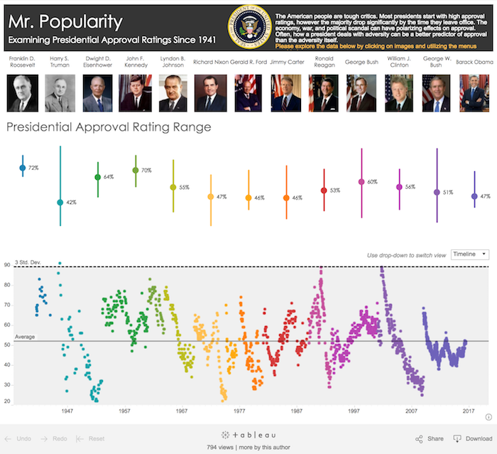
Past presidents' approval ratings
When the going gets tough, presidential approval ratings drop, says Dustin Cabral. "Most presidents start with high approval ratings; however, the majority drop significantly by the time they leave office," he says.
The data shows this downward pattern for almost every president since 1941 (Bill Clinton is the lone exception). But while some presidents' ratings bounce back up over time, others never recover from their initial decline. Check out Harry S. Truman, who started with the highest approval rating on the chart (91%), then dipped to the lowest (22%).
Got an election viz of your own? Tweet it to us using #ElectionViz!
And join us on Thursday, Sept. 29 for free virtual training on telling election stories with data. Our three sessions will cover how to find and prep your data, how to visualize that data, and how to perform sentiment analysis. Sign up to grab your spot.
相关故事

Visualizing Women's Impact to History Through Data Visualization
 2024/03/18

Behind the Viz: Adrian Zinovei Helps You Design Your Next Dashboard
2024/03/01

Charting the Heart: Data Visualizations on Love
 2024/02/14
Subscribe to our blog
在您的收件箱中获取最新的 Tableau 更新。