Subject Area: Design
Level of complexity: Intermediate
Approximate Time to complete: 1 hour
Companion Workbook (twbx): ReferenceLinesAsVisualStatistics.twbx
Additional Resources on the web:
- http://kb.tableau.com/articles/knowledgebase/Reference-Lines
- http://onlinehelp.tableau.com/current/pro/online/en-us/help.html#reference_lines.html
- http://www.tableau.com/public/blog/2013/11/control-charts-2236
- https://www.interworks.com/blogs/jwright/2013/07/19/tableau-table-calculations-and-reference-lines-extending-default-panes
Reference lines are a way of indicating an additional value (or values) to a view. This can be basic, such as adding a constant value or dynamic via the use of a parameter, measure or calculated field. There are also more statistical reference lines that customers can leverage. This includes quantiles, standard deviations, box plots and more. The following sections walk through examples of how our customers are using reference lines as a form of "Visual Statistics".
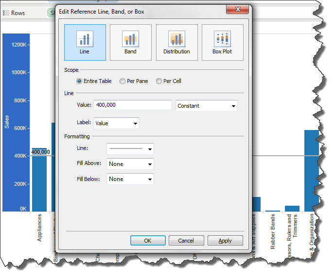
Example 1 – Constants
Constants are ideal if we want a static reference line that does not need to be changed by the end user. Only the individual authoring the workbook will have control over the value of the reference line. Below is an example of a reference line using a constant value (to bring up the Edit Reference Line dialog box, right-click on the axis and select Add Reference Line…).
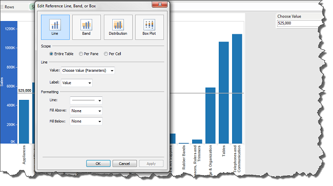
Example 2 – Dynamic via Parameters or Measures
Making reference lines dynamic through the use of parameters allows end users to choose a specific value for the reference line. If end users will be interested in different, changing values, parameter-driven reference lines are ideal. Creating a parameter-driven reference line is similar to the previous constant example, only the parameter field is selected for the Value:
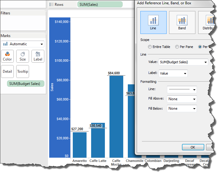
Additionally, reference lines can be dynamic and data-driven by using a measure. For example, we have a chart showing Sales by Product and want a reference line to indicate our Budget Sales. To do this, we need to add Budget Sales to the Detail Shelf on the Marks Card. We can then choose Budget Sales for our reference line value:
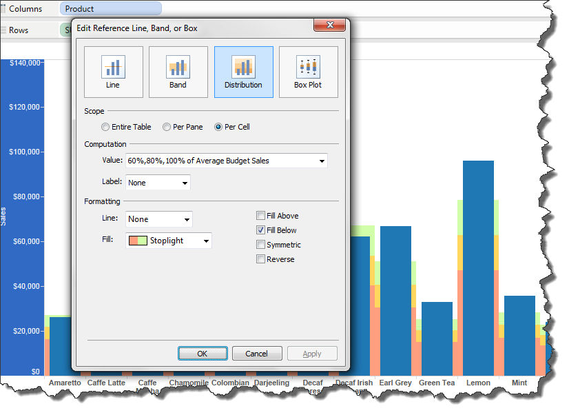
Example 3 – Reference Bands
To take the previous example a step further, we can choose to use a reference distribution band rather than a reference line. Distribution bands are great if we want to show a value and also indicate 60% and 80% of the value as well. An example is shown below:
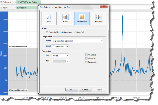
Example 4 – Control Chart
As a final example, we can leverage reference lines for more statistical analyses, like a control chart. Control charts are great to find out whether data collected over time has any statistically significant signals or whether the variation in the data is merely noise. "Six Sigma" is a common control chart. Below is a basic example of creating a control chart.
We can also add multiple reference lines to a single viz. For example, a best practice in the control chart would be to add an average reference line as well:
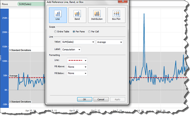
Additional steps can be taken on control charts to add more visual indicators. The following blog post goes into greater detail: http://www.tableau.com/public/blog/2013/11/control-charts-2236
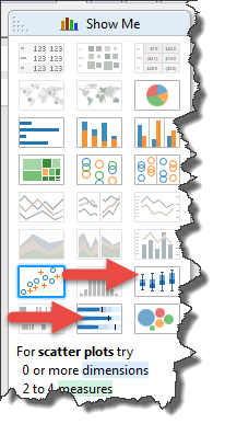
Example 5 – Show Me
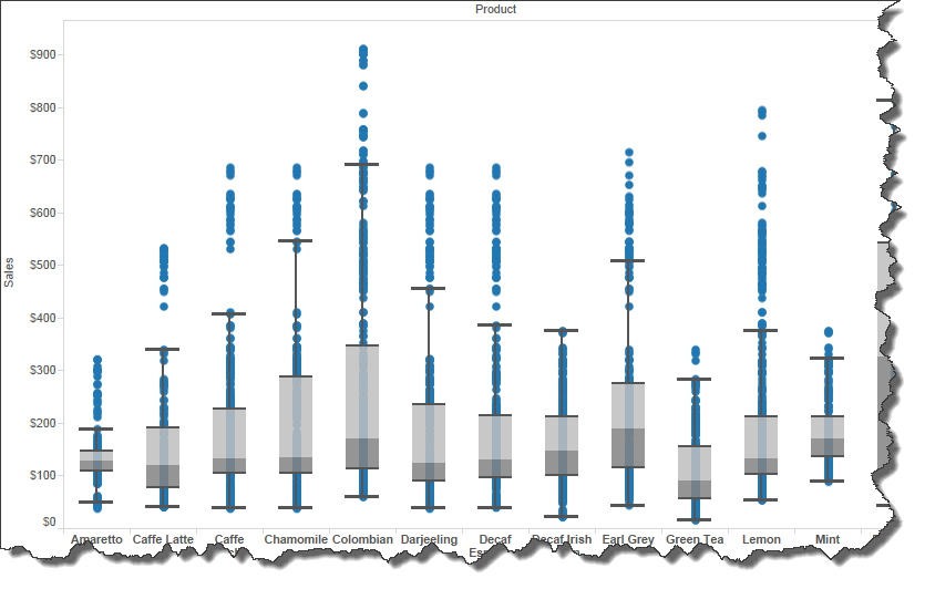
Tableau's "Show Me" feature can also be used to create charts with reference lines. Two examples are the bullet chart, which uses a distribution band, and a box plot.
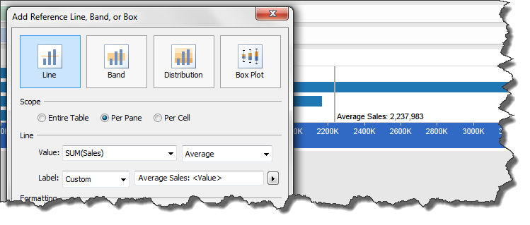
Example 6 – Custom Reference Line Labels
It is important to be aware of not overusing reference lines. A chart with numerous reference lines can quickly degrade its overall value. Strive to only use reference lines that will be meaningful to the audience, rather than adding reference lines just because it's an option. Also, if it is not clear, a best practice to indicate what the reference line represents, whether it's a goal, quota, average, median, etc. A good way to include this descriptive information is to use the Custom label type: