Subject Area: Design
Level of complexity: Intermediate
Approximate Time to complete: 30 mins
Companion Workbook (twbx): AddingHelp.twbx
Additional Resources on the web:
- http://www.interworks.com/blogs/wjones/2013/04/16/customizing-tableau-tooltips
- https://www.tableau.com/public/community/best-practices/tooltips
- http://kb.tableau.com/articles/knowledgebase/best-practices-designing-vizes-and-dashboards
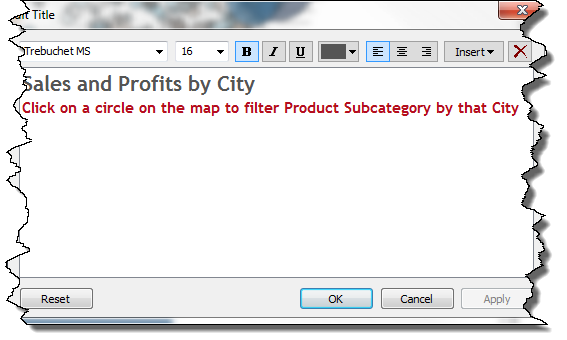
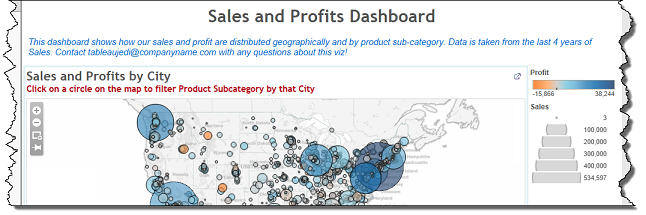
The use of text boxes, sub-titles, and tooltips in your dashboards can help provide context and guidance to end consumers. Text boxes can help give a brief summary of what's going on in the dashboard. Subtitles can be used to give instructions on how to use a specific view. Tooltips can be used to give extra information, highlight important information, or simply to allow end users to see the actual numbers behind a mark. Intelligently adding these textual pieces to your dashboard can help immensely with making a more immersive experience for end users. Subtitles should be used to either give more detail about the view or provide instructions on functionality in that view. In the example below, without a subtitle, how would end users know that they can click on a city to filter the Product Subcategory view. When providing these extra instructions, make sure to make them visually distinct from the title. Changing the size, font, and color of the text can give consumers a visual clue that the text serves a different purpose than the title.

You can include a subtitle simply by double clicking on the sheet title and then selecting from any of the options to help format the subtitle:
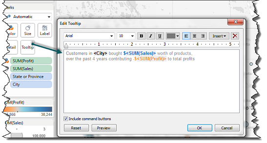
Tooltips are powerful features in Tableau but left as is can be a confusing or overwhelming for end consumers. At a basic level, tooltips are a great starting place to quickly see details about marks. To make them effective communicators of information, however, we need to do some basic formatting and cleaning before publishing a dashboard. Remove redundant information if possible. For example, a user hovering over a bar in the product subcategory view probably already knows which product subcategory they are looking at:

In addition, rather than just displaying the information, desktop users can provide more user friendly experience around the data by providing some context. Note the consistent color scheme between the data in the dashboard to the values in the tooltip:

You can edit a tooltip in much the same way you edit a subtitle, this time by simply clicking on the tooltip icon
Text boxes are a great way to provide additional information about your dashboard to end users before they dive into the data. Using text boxes effectively can give consumers an informative introduction to your dashboard that will give them a good idea of what they are looking, some basic information about the underlying data, and who they can go to for more information. Once again, make sure to make it distinctive from the other text or areas on the dashboard by changing the size, font, and color.
To bring a textbox into the dashboard simply click and drag the text icon onto the dashboard.
