Data-Viz Design: Provide Information on Demand


Note: The following is a guest post by former Iron Viz champ John Mathis.
How complex was your last dashboard? I’ve seen many dashboards crammed full of every potentially useful piece of information. The result bombards users with an overwhelming array of different charts, graphs, and tables. This forces people to evaluate all of these competing components to determine which one to focus on when they open the dashboard.
Recent research into “decision fatigue” suggests the more decisions you make throughout the day, the harder each subsequent decision becomes, no matter how simple the decision. By avoiding unnecessary decisions, you free up brainpower for decisions that really matter.
In fact, Mark Zuckerberg recently cited this research when he was asked why he always wears the same gray T-shirt and black hoodie. That’s one less decision.
Turning back toward dashboard design, let’s see how we can help people make one less decision.
Should I continue reading this blog post? Let’s make that decision easy: Yes!
People access your dashboard to inform a decision. You want to make sure they have the information they need to make that decision. At the same time, you don’t want to overwhelm them with all potential information. So where does the balance lie? The goal is to provide the information only when the user needs it, thus information on demand.
When building a dashboard, focus on the most critical piece of information. It should be paramount in your design and obvious at first glance. Second, think about what other pieces of information provide valuable context or enrich that information. Lastly, consider tertiary pieces of information that may provide additional insights but are only needed to dig deeper.
Now let’s put the idea into practice. Here is a visualization that exemplifies these points:
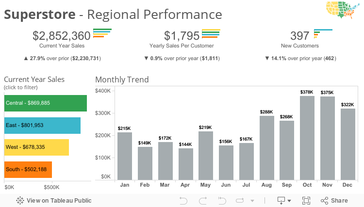
Let’s break down how this dashboard serves up information on demand.
Design to Add Focus
The paramount focus is on sales performance. The key metrics across the top provide an at-a-glance understanding of the performance. For context, the dashboard includes year-over-year comparsion (although in a real-world use case, it may be substituted with forecast data).
The charts below the KPIs provide the trend of performance. And the region-breakdown bar chart gives only the highest level understanding of comparative regional performance.
The secondary focus is on regional breakdown. Discrete colors make it easy to distinguish between the different regions. The micro bar charts next to each KPI give subtle indication of how those KPIs may vary by region.
When you select a region in the bar chart, a second bar appears in the time series. This chart details the region’s performance while retaining the context of the overall company performance.
This technique is called proportional brushing. It takes advantage of the order of operations Tableau applies to filtering fixed Level of Detail Expressions.
Other Tips and Tricks
Another simple but effective design trick is to do away with the default color legend. You can instead place a mini map and use the region bar chart to reinforce it.
This simultaneously makes it easier for users to understand the regions and actually conveys more information by illustrating exactly which states comprise each region. (This helps answer questions like, “I forget, is Colorado part of the Central or West region?”)
The final trick is including information which is not encoded in the visualization itself and is available via tooltip when people dig deeper. In this example, I included the top customer order for a given region/month and the percent of sales it represented. This provides helpful context when looking at the variability of regional sales.
When digging into the Central region’s performance, we can see that it accounts for over 40% of total sales in December. The tooltip then reveals that the largest single order was for ~$21k and is less than the couple months prior. This could be good news as less revenue is concentrated on a single customer.
Let me add a technical note on how this was accomplished. I used nested LOD Expressions to first calculate the total for each order (as there can be multiple line items per order). I then used a second LOD to find the largest order for a given region/month. I then compared each order total with the value of the largest to find and return the customer and location.
Although each trick is subtle, the cumulative effect is a simple, powerful visualization that has depth. Different flavors of these tricks can be used based on your business needs, but the concepts remain the same. The next time you are building a dashboard, challenge yourself to see if any information can be taken off the initial screen and instead provided on demand.
For more tips, ideas, and vizzes by John, check out his Tableau Public page and his blog, The Datographer. You can also connect with him on Twitter @datographer.
Subscribe to our blog
Tableau の最新情報をメールでお知らせします