Try a live demo of Tableau + Hadoop, right now.
Cloudera and Tableau have teamed up to give anyone who has ever wanted to try fast, interactive visual analysis against Hadoop the ability to do so. No downloads, no installations, no waiting.
Try Cloudera Live
Tableau Tutorial for Cloudera Live
Description:
This Tableau demo uses a 100 million row consumer packaged goods (CPG) dataset to illustrate the power of using Tableau with Cloudera Impala to rapidly analyze big datasets stored in Hadoop. Specifically we will be analyzing a dataset of wine sales to determine which flavors are the best and worst sellers, which brands sell well in certain markets, and analyzing our pricing model for each flavor. We will explore how using Tableau’s intuitive drag and drop experience combined with the speed of Cloudera Impala makes analyzing massive datasets fast and easy.
Demo Steps:
- On your computer, open the Remote Desktop Connection by opening the start menu and typing “remote desktop connection” and selecting the program above
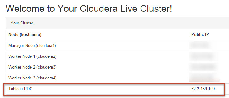
- From the Guidance Page (a link from your welcome email), find the Tableau RDC Public IP address
- Enter the Tableau RDC Public IP address as the Computer and click Connect
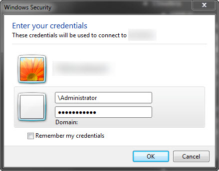
- When asked for your credentials, enter the username and password from the AWS portal
- Note 1: you may need to click Use another account if you’re not prompted for both a user name and password
- Note 2: if your Domain is autopopulated, enter \ before the username
- Once you're in the remote desktop, double click on the icon for Tableau 9.0 on the desktop
- You will be asked to begin register your trial and enter your information
- You are now on the Tableau Desktop Start screen. Select More Servers and then choose Cloudera Hadoop from the list of options
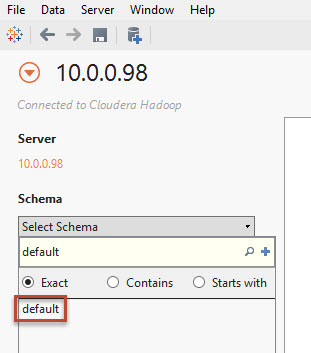
- Enter the following information in the Cloudera Hadoop connection screen and click Connect
Server: enter one of the private IP addresses from your Guidance Page - any worker node should work
Port: 21050
Type: Impala
Authentication: No Authentication - Click on the Select Schema dropdown on the left side of the screen and select default (You may need to search for "default" to populate the list)
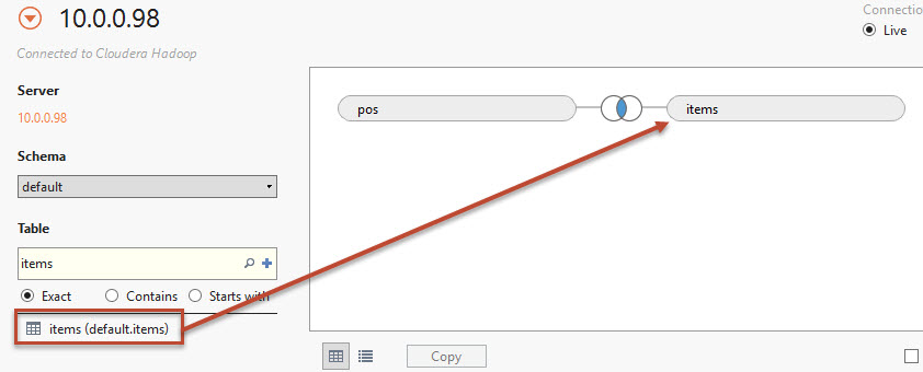
- Under the Table section search for the POS Table
- Drag the POS table to the connection pane (labeled "drag sheets here")
- Search for the Items table. Drag it into the connection pane
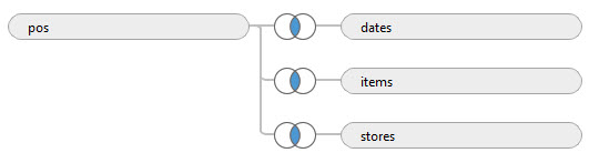
- Click on the link icon and verify that an inner join between Item Key and Item Key (items) has been selected
- Repeat steps 14 & 15 for the Stores table and the Dates table. Their join clauses should be Store Key = Store Key (stores) and Date Key = Date Key (dates)
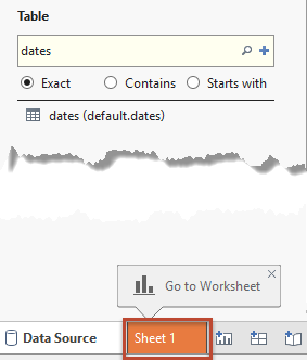
- Click on the connection name text in the the top right and rename it to “CPG"
- Click Sheet 1 at the bottom left of the screen
- Confirm that Tableau opens up with the available data fields in the left pane:


Change Default Aggregation and Number Format for Key Measure
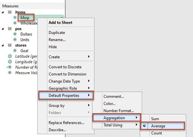
Tableau allows you to set the default aggregation and number format for measures that may need to be aggregated differently than the SUM aggregation or displayed in a different format the normal numbers. Msrp will be aggregated as Averages and displayed as dollar amounts.
- Right click on the Msrp measure, select Default Properties in the context menu, select Aggregation, then select Average
- Right click again on the Msrp measure, select Default Properties in the context menu, select Number Format, then select Currency (Standard), then click OK


Create the Price Distribution per Flavor viz
In this viz we are interested in seeing which price buckets our different products fall into. This will help us determine if our products are skewed to more luxury brands or commodity brands. To do that, we will make a modified histogram.
- Double click on the tab for Sheet 1 and rename the sheet Price Distribution per Flavor
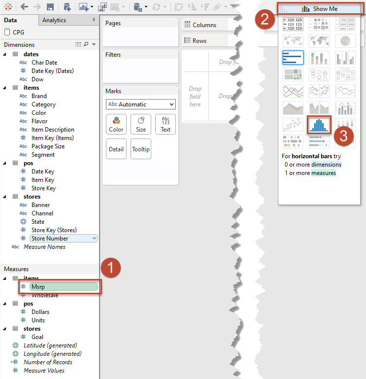
- Click on Msrp in the Measures pane. With that field selected, click Show Me to open the menu and select the histogram. Click Show Me again to close the menu
- Remove CNT(Msrp) from the Rows shelf by clicking on the pill and dragging it into the grey space of the canvas
- In the Dimensions pane, find the newly created Msrp (bin) field. Right click and select Edit
- Set the size of the bins to be 0.5
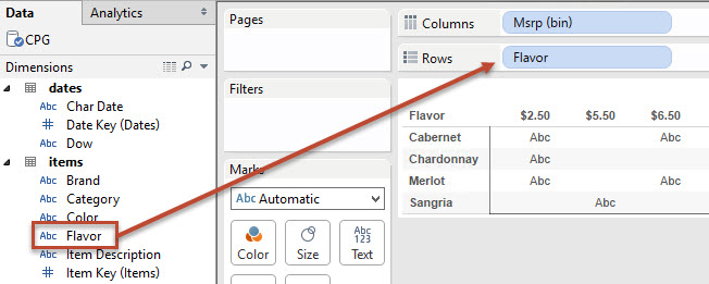
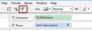
- Drag Flavors from the Dimensions pane to the Rows shelf
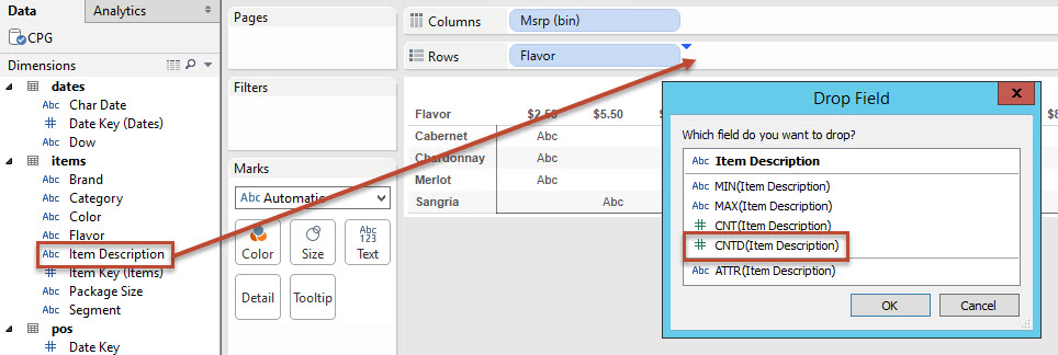
- Right click and drag Item Description from the Dimensions pane to the Rows shelf. Select CNTD(Item Description)
- Right click on the CNTD(Item Description) field on the Rows shelf and deselect Show Header
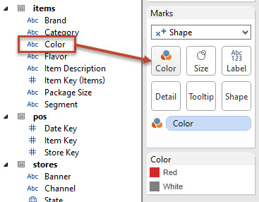
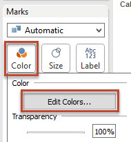
- Drag Color from the Dimensions pane and drop it on the Color shelf on the Marks card
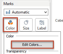
- Click on the Color shelf and select Edit Colors
- Click on Red on the Select Data Item window and then select red in the color palette
- Click on White on the Select Data Item window and then select grey in the color palette. Click OK


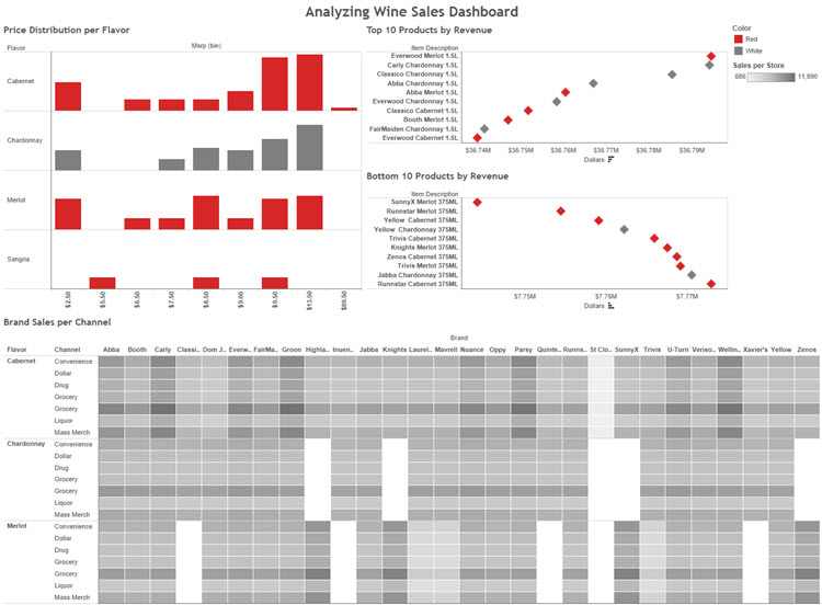
The view is now complete and we should be able to easily see that our Cabernet and Chardonnay products are skewed more towards our higher end offerings while the Merlot is evenly distributed between high, mid, and low level products. The view should look like this:
Create Top 10 Products by Revenue
In this next analysis, we will look at the top 10 products by revenue across all of our stores.
- Down in the tabs at the bottom of the sheet, click the New Sheet icon
- Double click to name the new sheet Top 10 Products by Revenue
- Click and Drag Item Description from the Dimensions pane to the Filters shelf
- Click on the Top pane, select By field, and change the field to Dollars. The aggregation will automatically change to Sum. Click OK
- Drag Item Description from the Dimensions pane to the Rows shelf
- Drag Dollars from the Measures pane to the Columns shelf
- Right click anywhere along the Dollars axis and select Edit Axis
- Uncheck Include zero. Click OK. This allows us to see more of a variation among the top 10 products
- Click on the Sort Descending option in the toolbar
- Change the Marks type to Shape
- Click on the Shape shelf and select the filled diamond
- Drag Color from the Dimensions pane to the Color shelf
- Drag Brand and then Flavor to the Detail shelf. This will allow us to do some advanced actions later on
- Let's make this a little easier to read. Click on the Size shelf and drag the slider to the second tick mark
- Right click on the Dollars axis (X axis) and select Format
- Select Numbers, then Currency (Custom), then change Units to Millions. This will make the Dollars axis easier to interpret
- On the format pane, click the X in the upper right hand corner to close it and reveal the data window


The analysis is now complete and we should easily be able to see that red and white wines are equally represented in the top ten sellers. The final view should look like this:
Create Bottom 10 Products by Revenue viz
In this viz we want to see the bottom 10 products by revenue across all of our stores.
- Right click on the Top 10 Products by Revenue tab and select Duplicate Sheet
- Rename sheet to Bottom 10 Products by Revenue
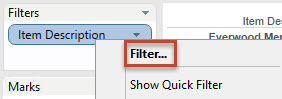
- Right Click on Item Description on the Filters shelf and select Filter
- Click on the Top tab and change from Top to Bottom. Click OK
- Click on Sort Ascending in the toolbar


The view is now complete. The final view should look like this:
Create Brand Sales per Channel view
In this viz we are analyzing the sales of our different Brands per Channel and Flavor
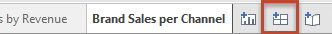
- Create a new worksheet and rename it Brand Sales per Channel
- Drag Brand from the Dimensions pane to the Columns shelf, then drag Flavor and then Channel from the Dimensions pane to the Rows shelf
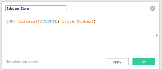
- As part of our analysis we want to use Sales per Store to provide us with a standardized view. This field is not part of the database so we will create it in Tableau. In the data window, right click Dollars and select Create > Calculated Field
- Name the field Sales per Store and type SUM([Dollars])/COUNTD([Store Number]) for the formula. Then click OK
- Drag Sales per Store from the Measures pane to the Color shelf
- Click on the Color shelf and select Edit Colors
- Use the drop down menu to change the color scheme to Grey Sequential
- Click on the Color shelf and set the border to be white
- Adjust the view to Fit Width
- Right click on the Sangria label in the view and select Exclude


The view is now complete. The final view should look like this:
Create Analyzing Wine Sales Dashboard
Now that the visualizations are built, they can be combined into a single dashboard. Connecting the visualizations in the dashboard will make it easier to find the business insights in the data.
- In the tabs area, click the icon for a New Dashboard. Rename it Analyzing Wine Sales Dashboard
- Select Price Distribution per Flavor from the Dashboard pane and drag it onto the canvas
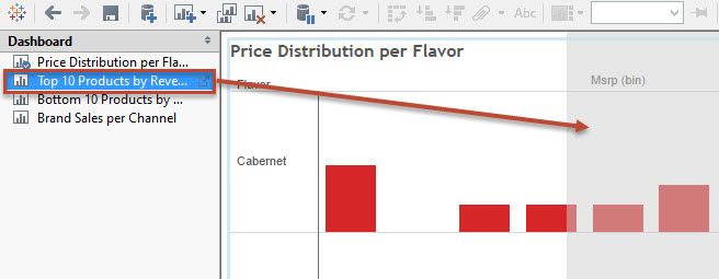
- Select Top 10 Products by Revenue from the Dashboard pane and drag it to the right side of the dashboard
- Select Bottom 10 Products by Revenue from the Dashboard pane and drag it to the right side of the dashboard underneath the Top 10 Products by Revenue Sheet
- Select Brand Sales per Channel from the Dashboard pane and drag it to the far bottom of the dashboard. The grey drop area should extend across the entire bottom
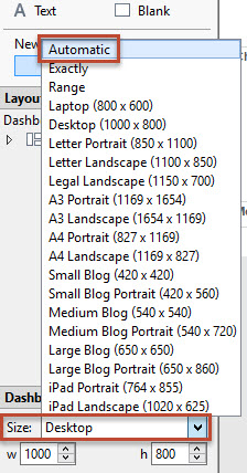
- Change the Dashboard Size to Automatic
- On each sheet in the dashboard click on the caret icon, select Fit, and then Entire View
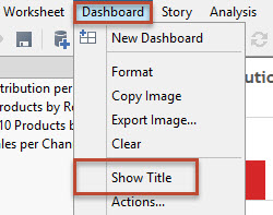
- Setting highlight filters helps call out the correlations between each visualization. Select Dashboard from the menu and then select Actions
- Select Add Action and then Highlight
- Deselect Brand Sales per Channel from the Source Sheets section. Change Run action on to Hover. Click OK and then OK
- Select Dashboard from the top menu and select Show Title


Congratulations, you now have a working, interactive dashboard!