How Accurat's Giorgia Lupi Approaches Data-Viz Design


Note: The following is a guest post by Giorgia Lupi of Accurat and the Dear Data project.
Information design is playing an increasingly critical role in every project that uses data and quantitative information to communicate facts or stories, and more and more data visualizations can be compound, rich and multi-layered.
In our view, to be a designer you have to find new ways to attract people's attentions through new languages, new products, and new solutions that besides being functional, accurate, and appropriate must be magnetic and surprising.
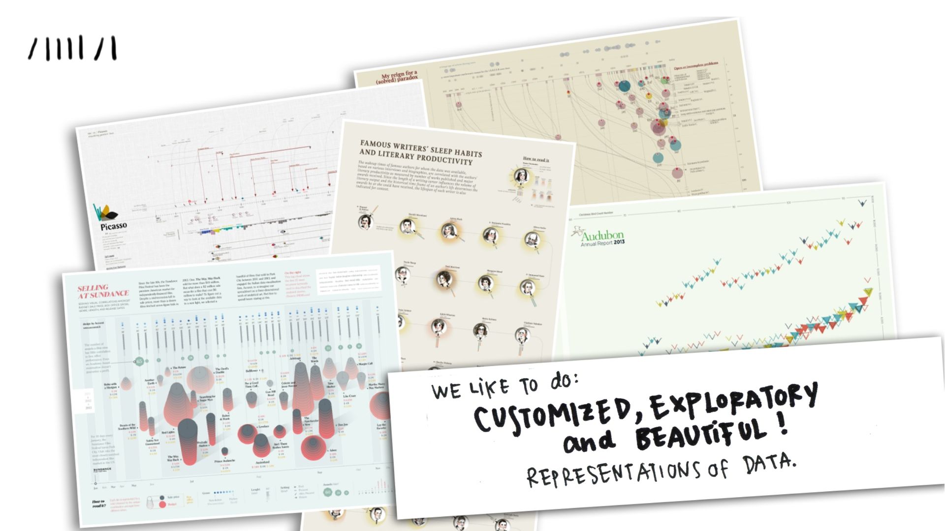
At Accurat, we create data visualizations and interactive analytical tools; we really tend to never start from so-called “visual standards” when we visualize data; we never start by listing the possibilities that we have or by seeing what the tools we use can easily create. We like to design very customized pieces every time, exploring how these analytical representations can be beautiful and pleasant while of course keeping the accuracy of the data analysis intact and clear.
I am responsible for the design direction at Accurat, and most of the time I am supposed to come up with design ideas for our data visualization projects. Over time, I have developed my own method for doing so: What I always do when I start every kind of project is to allow myself to have the time it takes to get truly inspired by the world around me while keeping the “brief” in mind.
Every day I spend a great amount of time looking for visual inspiration, and carefully and maniacally organizing those different kinds of images I find on Pinterest (that is my tool for that, and I love doing it! It really gives me a compulsive pleasure!).
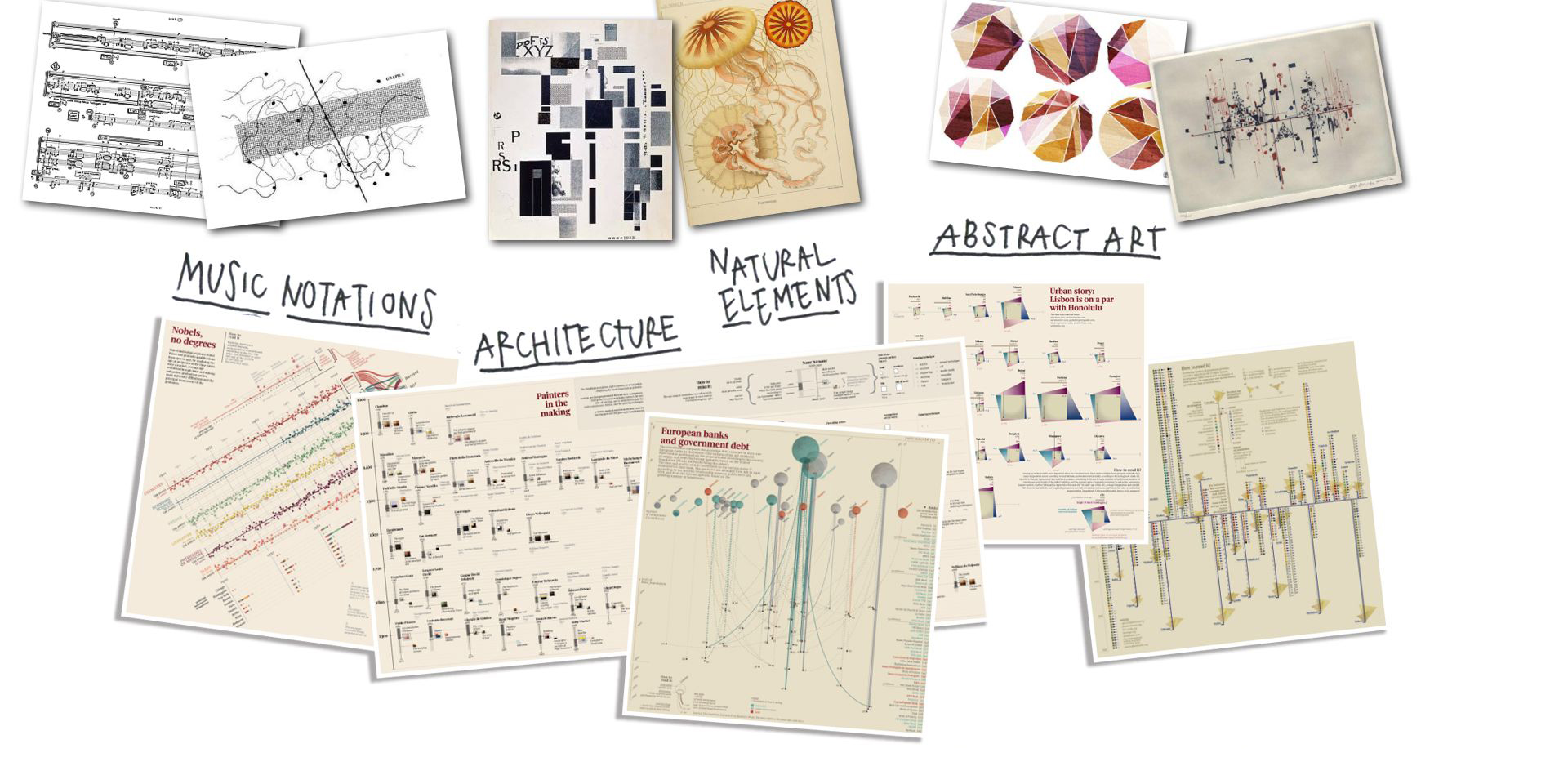
This technique is important not only for amusement but as a necessary practice that can be suggested to any kind of designers: It is very important to keep a curious and critical eye on everything that strikes your attention, and to understand why it acted as a constant resource for inspiration and for transferring what we like, visually speaking, into our visual taste.
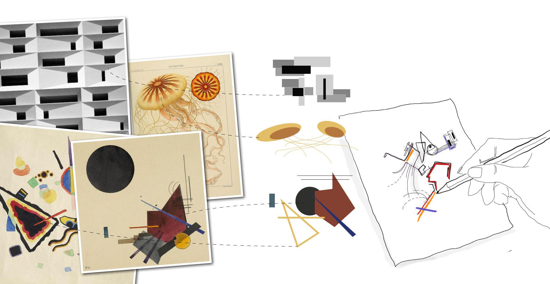
Looking for clues in unusual contexts can definitely be described as an attempt to discover and dissect the aesthetic qualities of all the things that we naturally like in order to be able to abstract them and introduce them as core principles and guidelines in building visual compositions.
I ask myself the questions: “What is it that I like of what I see? What elements, aspects, and features do I appreciate and why?”
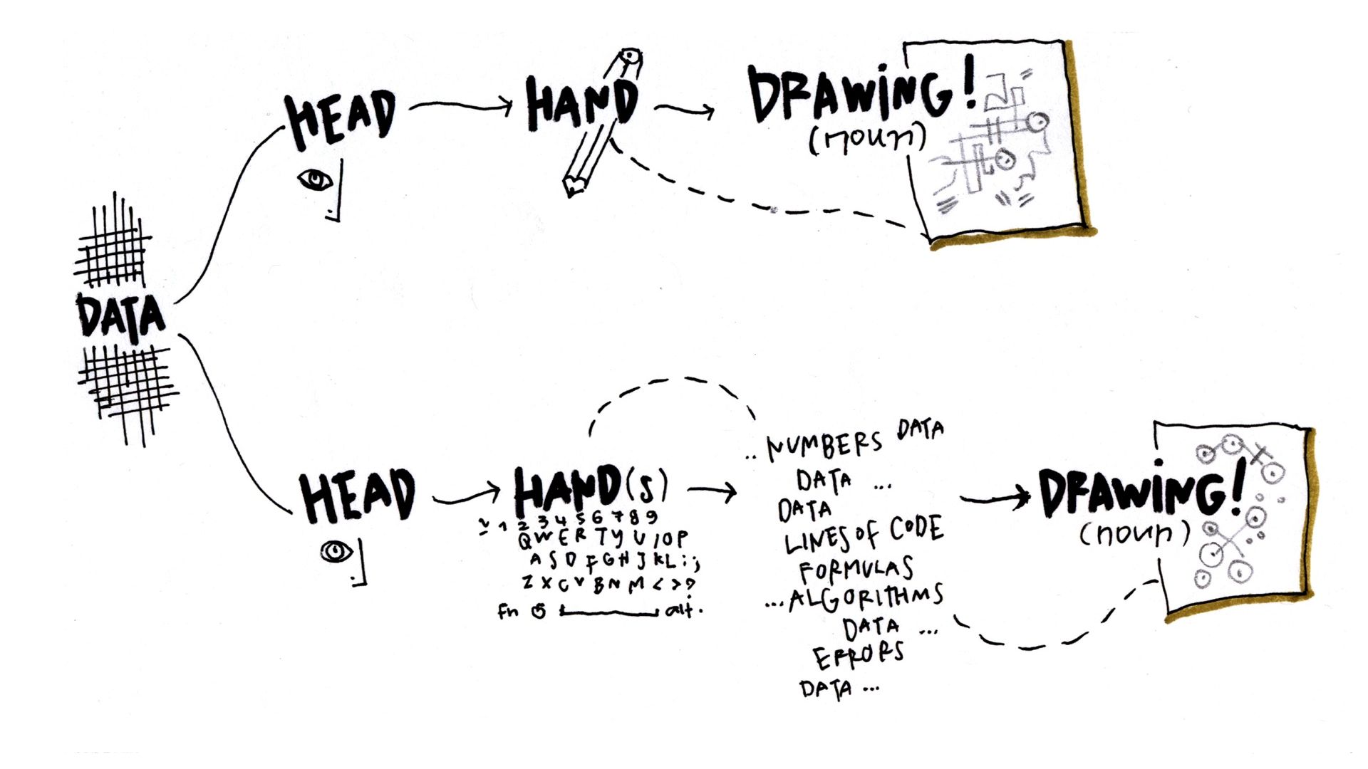
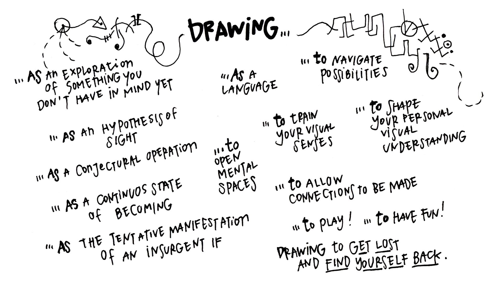
What I then do every time, whether I have a project in mind or not, is I draw what I see. I retrace what I like of what I see.
I see drawing as a tool for capturing ideas and for showing an idea you've already defined. But it’s infinitely more powerful in helping that idea take shape.
I see design as a way to translate a structural concept for a specific audience through a specific medium; design for me is also the process of visual planning and organizing the choices made along the way of a project, given its specific boundaries.
Drawing becomes design when you start tracing lines that help you rationalize what you think and envision as a possible solution.
Specifically, in designing data visualizations, I think a very common approach is to start with the tools we can produce, and maybe also from what we feel comfortable in doing with these tools. But I think that none of us wants to be driven by this.
The fact then that since I can't have data on paper when I am sketching what comes to mind and designing a data visualization, I feel that it is very helpful to explore visual features and visual aggregations that start exactly from what you have in mind, and that can serve to open questions on the data itself. I see this as a shortcut from your head to the final piece of data visualization.
While designing data visualizations there are normally three distinct phases for me in my design process.
A first phase is when I am interested in the main macro categories of data we are analyzing (i.e. the kind of topics we are talking about, the eventual correlations, and the number of elements we might have—such if they are fifty or five hundreds). In this phase I am mainly interested in understanding the macro categories to start sketching first visual possibilities about the macro organization of the layout or the “architecture” of the visualization.
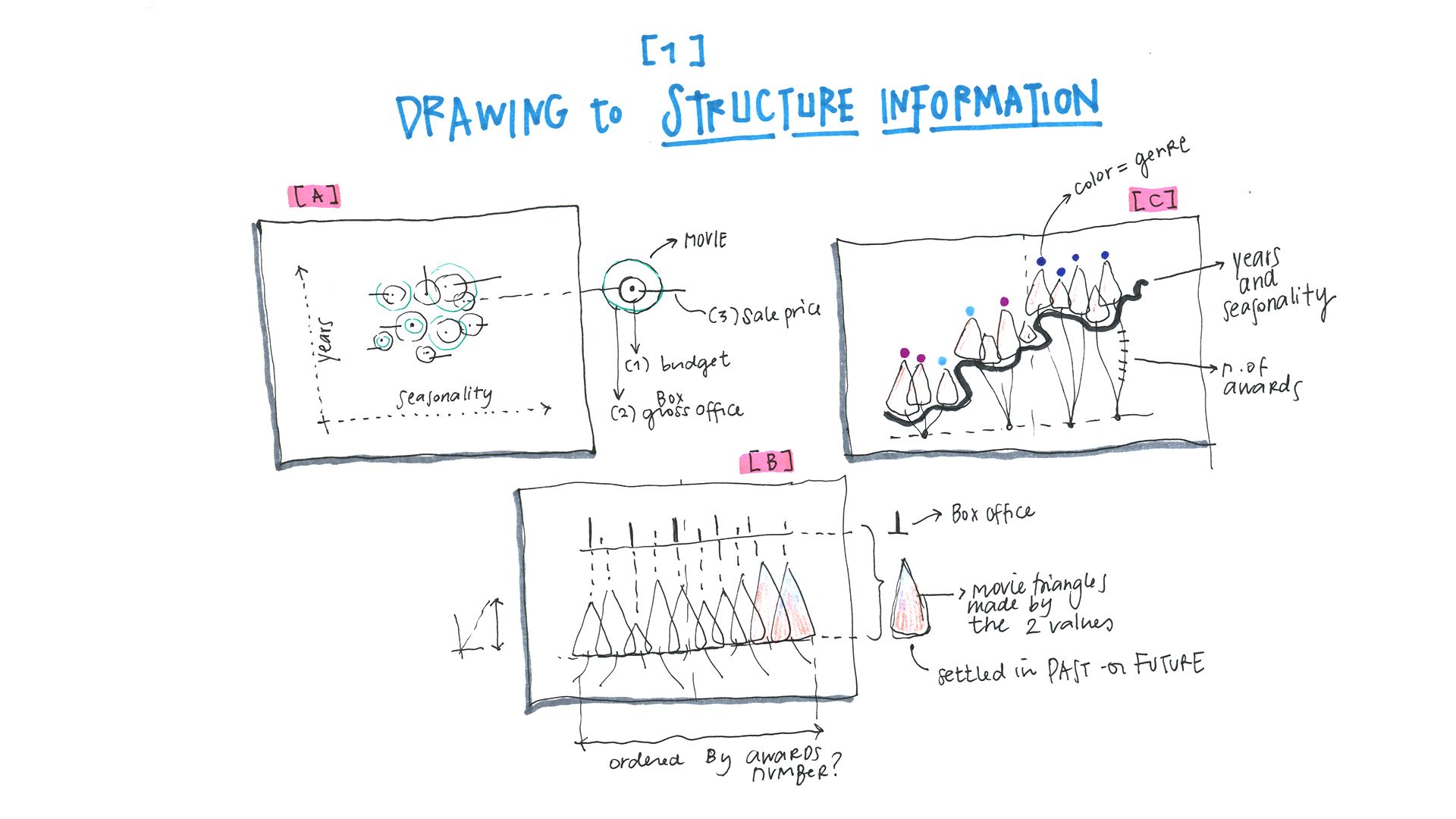
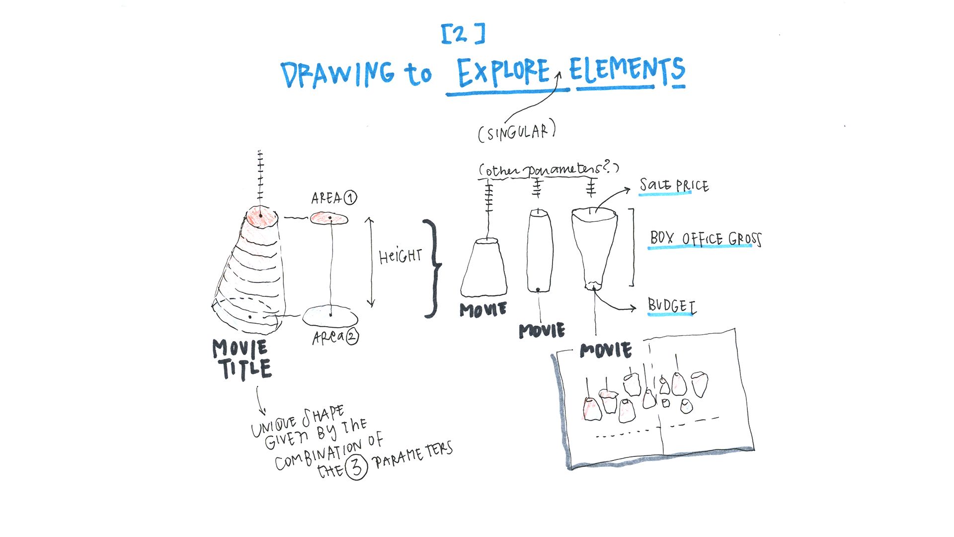
Then a second phase is when I just focus on the singular elements, the entry points that we have, to figure out which shapes, colors, features we might invent to better represent them according to the type of variables we have, and to maybe see if we can get some macro groups or underlying categories.
Here is the phase where before even getting digital I need to have a drawing that can visually sum up of all the choices that we’ve made. Only in this way can I feel ok about the project.
To conclude, I generally have a final phase when I structure what I’d expect to finally create, not in illustrator (digital format) but on paper. This stage is when we’re pretty sure that we can go ahead with the visual models we've designed (or that we've redesigned), and I would refine the sketch before getting digital to have everything in the same place, to have a draft piece that can be easily sharable with clients for quick feedbacks and comments.

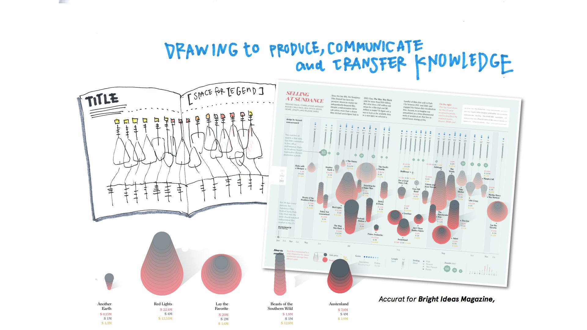
Of course, I’m describing only the very first part in a longer process that also involves the execution part and most of the time also the software development process (because in real life, unfortunately not all of the clients are ok with buying only sketches from you). This process is also not always as linear as I described it, but what I wanted to point out with it is really the approach we try to keep every time.
And coming back to data visualization, I think that it is valuable to try to embrace this indeterminism: These open possibilities that derive from free visual explorations, without the boundaries that you can have while drawing and while having the data only in your mind, to shape a visual understanding of those data, to open mental spaces, and to allow unusual connections to be made.
Abonnez-vous à notre blog
Recevez toute l'actualité de Tableau.