Create Dynamic Tableau Dashboard Layouts with Sliding Containers


Note: This is a guest post by Tableau Zen Master Robert Rouse. This post first appeared on the InterWorks blog.
One of my favorite tricks in Tableau is replacing a section of a dashboard with new content in a way that leaves everything clickable and doesn’t require navigating to a different tab. Explore my precipitation viz above to see what I mean.
The basics of this idea were covered in the "Sheet Swapping and Popping" blog post by Matt Lutton. This post describes more specifically how my viz swaps drought maps for details on a state based on a click action.
The How-To
The most common way to achieve our goal is to have two (or more) worksheets in a vertical container, as described by Dustin Wyers in this blog post. But we can take this concept further to show or hide more than just a worksheet. How so?
Fundamentally, there is one blank worksheet that is visible or invisible, using the same idea as the above post. That worksheet then pushes other content outside the dashboard area or behind a floating container. The animation below shows how it works in my precipitation viz:
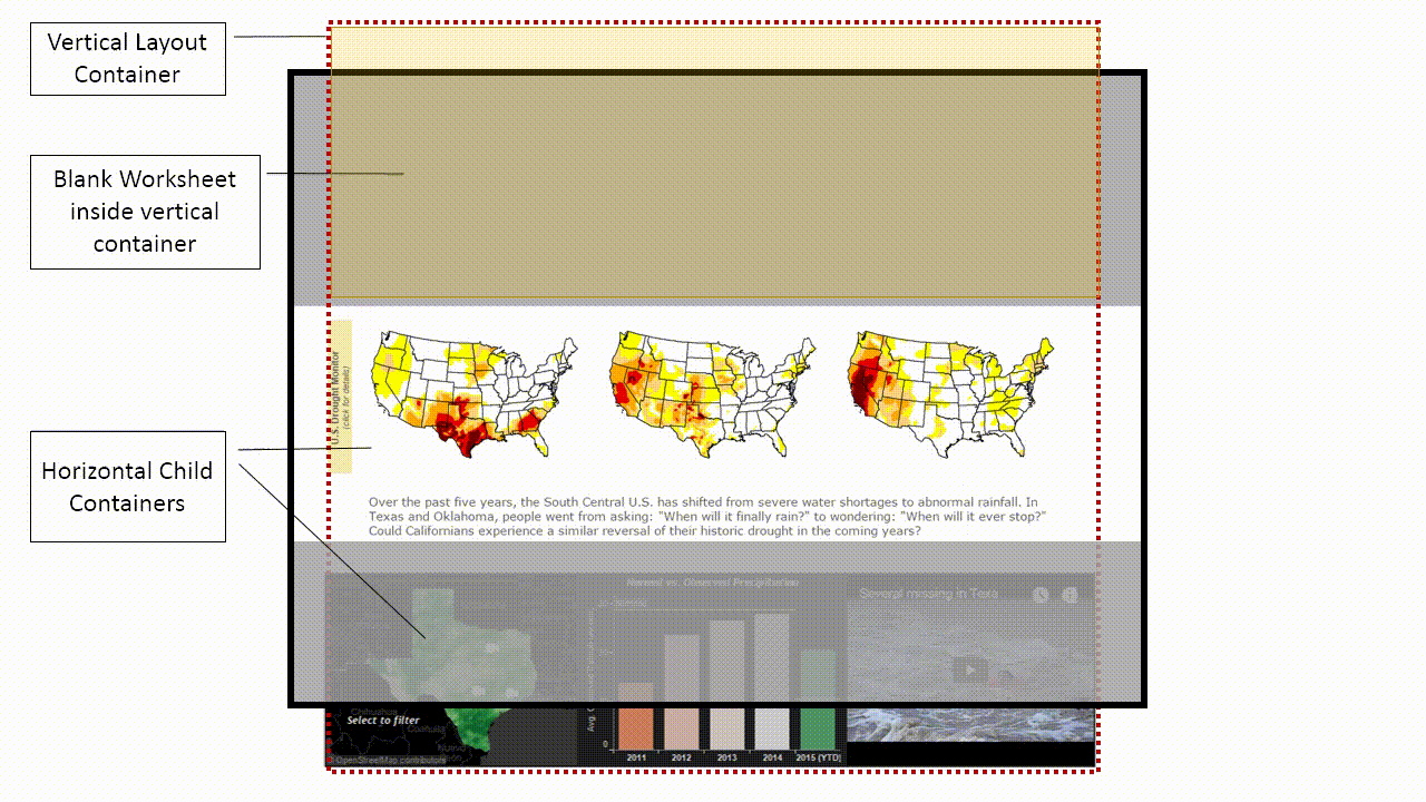
I have exaggerated proportions to highlight the fact that floating containers are not limited to the dashboard area. This means you can swap your entire dashboard if you so desire.
Note: You can use child containers for more advanced layouts as long as the blank sheet is not in a child container itself.
Breaking It Down Further
To get a better idea of how this solution is set up, let’s break things down further. There are three main areas here:
• A title area that’s a floating container (gray, shaded area)
• A footer area with clickable worksheets that drive action filters
• A vertical container extending beyond the dashboard area, floating behind the other two containers
We can go even further and look at the anatomy of the vertical container mentioned in that last bullet:
1. Top: This contains a blank worksheet that hides when there is only one state selected (someone clicks the sheets at the bottom). When it’s hidden, the bottom two sections move upward. Important: This sheet is sized to “entire view.”
2. Middle: Here we have a fixed-height, horizontal container that contains three images pointing to the source URL with more details.
3. Bottom: This has a fixed-height, horizontal container with two worksheets and a web page (for the videos).
That’s all there is to it. This seemingly-complicated dashboard layout really isn’t all that difficult to piece together when you look at it more closely.
Advantages and Other Possibilities
So why should you consider using dynamic dashboard layouts in your visualizations? Below are the obvious reasons along with some other interesting points:
• You can show/hide content like web pages or images, not just Tableau worksheets.
• Irrelevant quick filters can stay hidden until a user selection makes them useful.
• Keeping content on one screen can maintain context better than switching tabs.
• With multiple blank sheets and some clever action-filtering, you can have multiple “steps” in the sliding containers.
• You have more layout control than Story Points.
• It works horizontally, too!
I’m sure there are more possibilities than even those I’ve mentioned, but that should whet your appetite for more advanced layout control. With a little creativity, you can make different forms of visual communication work together quite nicely in your Tableau dashboards.
Are you using dynamic dashboard layouts in new and interesting ways? Share links to your Tableau Public dashboards in the comments below. I’d love to see them!
For more works by Robert Rouse, check out his Tableau Public page and his blog posts on the InterWorks blog.
Abonnez-vous à notre blog
Recevez toute l'actualité de Tableau.