When Designing Dashboards, Consider the Audience


Note: The following is a guest post by Mike Roberts of Pluralsight.
My wife recently ran the San Diego 100, an endurance race that demands a lot of training, focus, and grit. Trail runners from all over the world spend up to 32 hours running 100 miles of trails without stopping. Yes, it’s pretty epic and I couldn’t be more proud of her accomplishment.
As runners, there’s a need to make sure one can at least control the controllable aspect of any race. This can include, but isn’t limited to, food, pace, and gear. While we made sure the food and gear were set, there was the pesky notion of pace. How, considering so many variables, does one estimate and control pace? Data, of course!
I decided to create a dashboard. This wasn’t a tool for her to use on the run; rather, it was for me (and other crew members) to use to ensure she stayed within range to finish in the allotted 32 hours.
We needed to know a few major things: aid stations (and distance between them), elapsed time, total miles run, and total miles remaining. Lastly, and perhaps the most important to all runners, we also looked at weather data. If it’s hot and humid, a runner will need to adjust both pace and food. Our analytical tool, then, would need to also have live weather data, preferably on an hour-by-hour basis.
Before starting, we extracted two major data sources. First, we converted the PDF of the aid station data to a CSV file and added a few fields (most notably a field to sort the aid stations since they do progress in order).
Second, we needed weather data and wind speed to augment our analysis as she was running into the night. (Runners who've run into 20-mph headwind know why this might be important.)
Design with a Purpose
Let’s take a look at how this specific visualization and tool suited our needs.
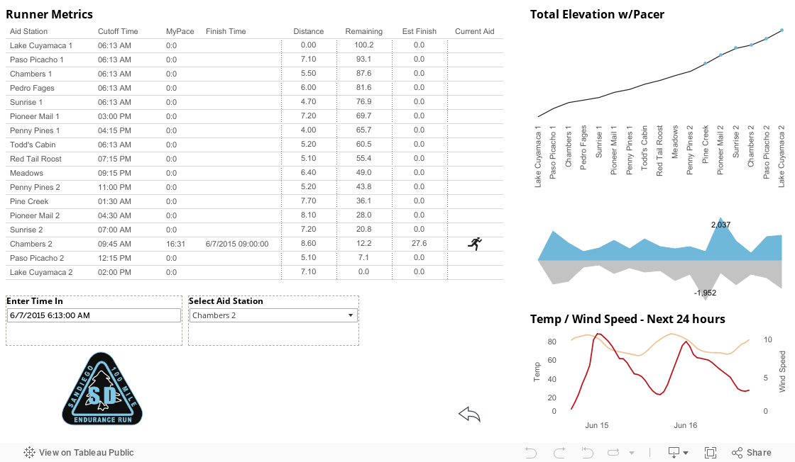
In the above dashboard, the runner metrics section is where we’d spend most of our time (which is why I placed it at the top left corner). As my wife enters each aid station, we’d enter two pieces of information: time and aid station. From there, we’d be able to see current pace, estimated finish time, and a lot more. (Note: A separate version takes a snapshot of the pace and timing from the race website in order to perform some historical analysis. Really, it’s just a postmortem on the race because all 100-mile finishers want to run more!)
Also, the above viz has the entry forms (both parameters) bordered by a dashed line. This primes the user to know these sections can be manipulated and updated. I’ve also colored the row lines at 40-percent gray to further call attention to its left-to-right aspect (notice that the column lines have been removed).
The example also contains ample white space, which makes it more user-friendly. I believe proper and elegant use of white space often gets overlooked. (See here and here for further details.)
Prioritize the Most Pertinent Information
In the end, our analytical tool should be understood by what it allows us, the crew, to do and not by what we need to do to use it. If we’re stuck trying to understand how to use it, we are not really able to use it and, therefore, its purpose is lost. Always consider the audience first and then begin to strategize on a visualization.
The entire right half contains supporting information that’s not necessarily needed for info entry but is still valuable to the race and our crew. I’ve decided to share labels between the top chart (total elevation) and the chart below it (elevation gain/loss), because they show the same aid stations from different perspectives. What’s more, there is a hover action on the top chart that highlights where the runner is located in the middle chart (elevation gain/loss). The hover action keys only on the aid station field as the others are not needed to highlight the corresponding elevation chart.
As mentioned above, the functional aspect needs to consider the audience. In this case, the audience is the pace crew managing numerous variables. The potential for night viewing (and freezing temperatures) required a tool that could get information quickly and, if there was time, augment it with other data.
As a result, the right side is the extra information which, if desired, can be consumed with ease. A quick glance at weather and wind speed (bottom right chart) can enable the crew to prepare for my wife as she comes into the aid stations. And, while we didn’t mention this to her, we could also get her ready for climbs (after having run 70 miles) by getting different food and gear ready.
Create Simple & Purposeful Dashboards
When designing any analytical tool or report, one must always consider the impact to its user(s). For our purpose, the above worked perfectly. If the purpose was to perform some historical analysis on the race’s participants, then this tool would have been much different in both style and usefulness.
That said, always consider the white space and its massive influence on the balance of a visualization. I’ve seen way too many Tableau dashboards, reports and workbooks that do not consider margins, white space, or balance. We’d all have a terrible experience reading this if it were one jumbled piece without spaces and paragraph breaks. White space rules always apply to the parts that make up the whole; so, yes, each chart and calculation should embody those principles of the dashboard: simple yet purposeful.
Many of you may be wondering how my wife did. Well, she finished and received her medal and belt buckle (a tradition amongst ultramarathon runners). She couldn’t be happier to be done. She was also surprised to learn just how hard it is to run at night, even with her headlamp and extensive training.
As her crew, and because of this Tableau analytical tool, we were able to adapt to her pace and needs as they related to clothing and food. In sum, she was never waiting at an aid station for us; rather, it was the reverse. If you’ve ever performed any endurance event, you will know how wonderful it is to have a crew there waiting for you and help you through a difficult patch.
Abonnez-vous à notre blog
Recevez toute l'actualité de Tableau.