Subject Area: Design
Level of complexity: Advanced
Approximate Time to complete: 2 hours
Companion Workbook (twbx): complexscorecardwithconditionalformatting.twbx
Additional Resources on the web:
- https://public.tableau.com/profile/#!/vizhome/conditionalformattingv4/Introduction
- http://community.tableau.com/ideas/2487
- http://kb.tableau.com/articles/knowledgebase/kpis
- http://kb.tableau.com/articles/howto/conditional-format-row-background-color
- http://drawingwithnumbers.artisart.org/older-but-still-useful-conditional-formatting/
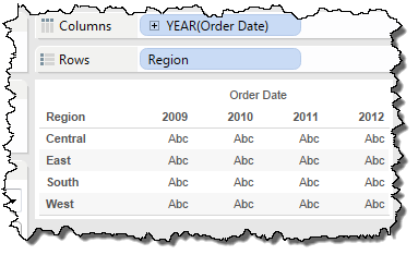
When Tableau Customers want to create a complex scorecard, we first will point them to some resources to create KPIs and conditional formatting of individual measures (links above). Once the KPIs are built we can start to build out a scorecard. Start by creating a crosstab type of view with the desired dimensions. In this example we are going to use Region on rows and Year(Order Date) on Columns.
For the next step we need to use a technique to create conditional formatting for each column. To create individual marks card for each column we use Min(Number of Records) on columns. Copy this for as many different measures you want to include on your scorecard. In this example we're going to use Profit, Profit Ratio, and Profit YOY (Profit YOY is a materialized table calculation that compares Profit from the previous year).
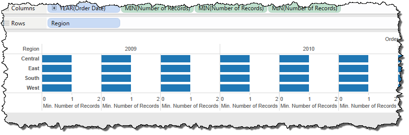
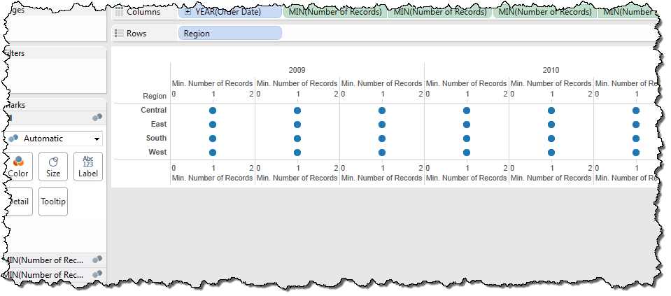
Because we want to add the Column headers to the top we are going to use another Min(Number of Records) for each and create a dual axis. Make sure to remove Measure Names from color on all marks card. We'll worry about formatting the headers later.
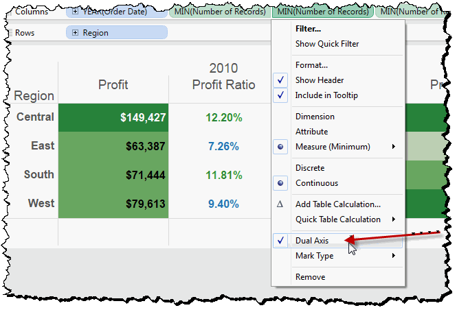
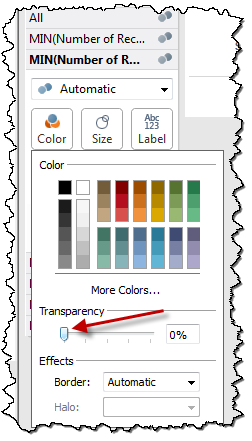
For the first column (Profit) we are going to use the Conditionally Formatting Cell Background Color technique outlined here. To change the colors of your KPI, double click on the legend and choose desired colors. The second column we're going to keep the mark type as text and add Profit Ratio KPI to color. The third column we are going to create arrows with the shape mark type. The arrows will point down or up based on the Profit YOY KPI that will be placed both on the color and shape button. Changing the shape is similar to changing the colors. Double click the legend and choose the arrows palette for the up and down arrows. We then need to edit each of the Min(Number of Records) that has been added to dual axis by clicking on the color button and sliding the transparency to zero.
Now that we have the basic table structure we need to format the header labels. First step is to make the bottom headers blank by right clicking on the x-axis and choosing edit. Make the title blank and under the tick marks tab select none for both.
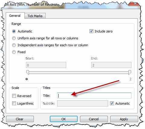
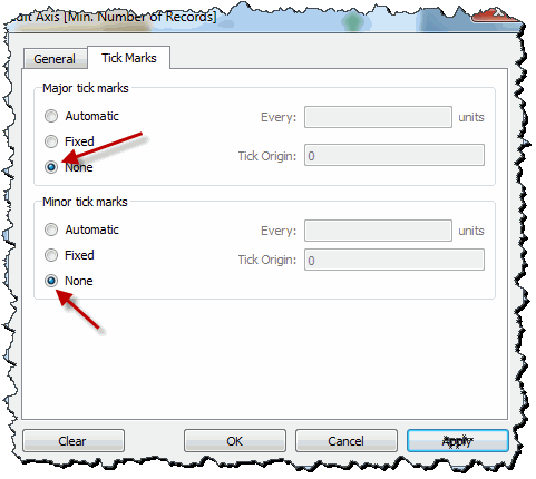
Now we want to add our top headers. Right click on the top x-axis and choose edit. Change both the tick marks to none and add your own Title for each column. Next step would be to edit the format of the headers and pane fonts to your liking. The end product should look like this:
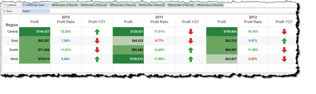
You can now add this scorecard to a dashboard and create actions to make the scorecard interactive with other views like a time trend.