Comparing Standardized Math Tests: Check Out Your WA School District


Nevertheless, my interest in Washington State math instruction has been useful to my work at Tableau. As the Director of Visual Analysis, I need to use our products authentically to see and understand data so that I can know how to improve the user experience for our customers. Since I have an authentic interest in the math testing data about Washington State, I explore it as a way to identify where our product is easy and hard to use. The rest of this posting describes how I did this and what I learned about Tableau and the test data. At the end, I include a link to the workbook, which you can view in our free Tableau Reader if you are interested in looking at the data for school districts in Washington.
DATA:
The first step was to access the test data. Since I was interested in the WASL test (Washington Assessment of Student Learning), Google quickly lead me to the website hosted by the Offices of Superintendent of Public Instruction (OSPI) to report WASL data:
http://reportcard.ospi.k12.wa.us/summary.aspx?year=2006-07
I found it pretty easy to use this web interface to see data about the state or individual school districts but I found it inadequate for answering comparative questions such as the relative trends of two school district. What I needed were views of data that were designed to support comparison so I turned to Tableau Desktop, which is a great tool for designing interactive graphical views of data. To use Tableau Desktop, I needed the underlying data rather than the summary data that was reported in the web interface. Turned out the OSPI provides this data as a bunch of Excel files on the following page:
http://reportcard.ospi.k12.wa.us/DataDownload.aspxThis was great except that each file had a unique set of columns and different years used different names for the school districts. I quickly found this out when I loaded the files into Tableau and spent a couple of evenings cleaning up the files and joining the resulting data with an address file that OSPI also provided. The result is quite useful but much more work than access to a database hosted by OSPI.
VISUAL ANALYSIS:
Since I was interested in comparative questions, I got very excited when I saw that the download page included the test results of the ITBS, which is a nationally-normed test produced by the University of Iowa. It turns out that the WASL and the ITBS were given to most of the students in the state from 2000 to 2005, which means I could create a view that validly compared the two tests. However, I was interested in the data at both the state level and district level. Although Tableau does a great job of aggregating data to different levels of detail, the ITBS data was reported as national percentile ranking. Therefore, I had to be careful and not sum or average this data. The result was that I ended up with four sets of data (WASL, ITBS at the state and district level of detail), which resulted in the following view:
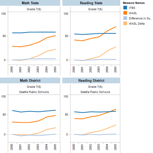
The top pair of views compares the WASL and ITBS at the state level and the bottom pair at the district level. The WASL data is percent who met standard and the ITBS data is the national percentile ranking. The lines starting at zero show the delta from the first year shown. The visual finding is pretty interesting, which is that the WASL tended upward while the ITBS stayed flat. Since the ITBS is nationally-normed, this view told me that I should not use the WASL results to inform my opinion about the math instruction in Washington State.
Many other comparative views can be designed for this data. For example, here is a view for comparing the WASL results of school districts:

This screen shot includes a quick filter on the right that can be used to select the school districts for comparison. You can download the packaged workbook and play with this view in the free Tableau Reader.
CONCLUSION:
This example contains some useful lessons:
- Data found on the web will probably require cleaning
- Be careful what you aggregate. For example, national percentile data should not be summed or averaged.
- Visual analysis is a great way to answer comparative questions as long as you have the freedom to design the appropriate view for your question.
Suscribirse a nuestro blog
Obtenga las últimas actualizaciones de Tableau en su bandeja de entrada.