6 Techniques from Our Experts


We’re happy to see that customers’ love of 6 is increasing by the minute! Matt writes, “It's the best I've ever had. I love the super charged extracts and the data blending. It's opened new doors for me and my team!”
As you experience the joy of 6, you might find yourself wondering: Am I doing this right? Do I need special 6 education?
We want you to know that having questions is completely natural. In fact, based on real questions from our customers, we’ve put together a few 6 techniques.
Q: I am trying to figure out how to use Parameters in a Histogram to establish Specification limits. How could that done?
A: Sometimes the best way to learn is by watching. Check out one of our favorite videos: http://www.tableau.com/ondemand/training/parameters.
Q: Is there a way to configure the fields displayed (and the order of the fields) when right-clicking and selecting ‘View Data’? By default it displays all fields and we’d like to just display a subset of fields in an order of our choosing.
A: You can configure the order of the fields in View Data simply by dragging and dropping them (on the header) where you want them

As far as selecting which fields to display, unfortunately you cannot pick and choose. If possible, you can take the fields you do not want to see out of your visualization (so they would not appear anywhere in the view you are making, although it would still be in your dimensions and measures shelves) and uncheck “Show all fields” in the View Data window.
Q: How do I create a motion chart? How do I combine two charts into one… such as a line chart and a bar chart together?
A: Motion charts are a fun new way to show off your data - 6 makes it possible. Just follow these step by step directions depending on what kind of data you're using:
1. Place anything on the page shelf (has to be a dimension)
a. Click on the “Show History” button
b. Press play and enjoy. You may have to edit and change it to get it the way you want.
2. Place two measures on either the columns or rows shelf
a. Click on the dropdown for one of those measures and select “Dual Axis”
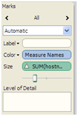
b. Click on the drop down again to change the mark type
c. On the marks card click the drop down and select Multiple Mark Types
d. Then you can shuffle through the marks with this:
Q: Is there a way to dynamically display the top n values based on varied groupings? i.e. We can show ‘Top 20’ salespeople – but what if we group by state, product type, etc?
A: The Top x issue is a common question but can be solved relatively easily. Just place the group on the filters shelf as a context filter (drop down on the filter). This essentially makes this the first item computed in the filters and this allows the top X to change as you filter.
Suscribirse a nuestro blog
Obtenga las últimas actualizaciones de Tableau en su bandeja de entrada.