Twitter Dashboard a hit @ The Economist event


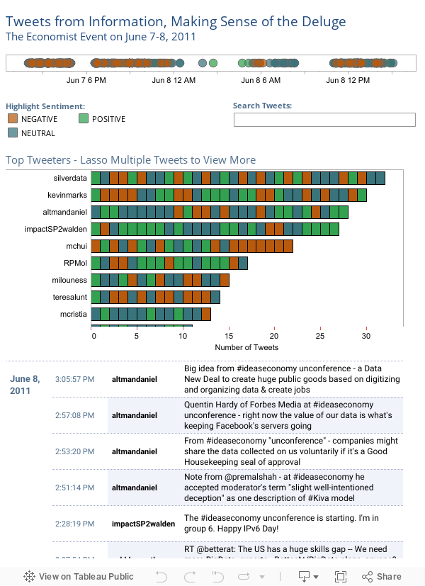
Who said what? When? Why? How often? At last week’s Ideas Economy event, “Information: Making sense of the deluge” in Santa Clara, Tableau put an exclamation point on the power of visualizing information. Now you can do the same.
Elissa Fink, VP of Marketing for Tableau, followed a line-up of premier speakers who extolled the virtues of visualizing data to make sense of your information. Before announcing the winners of Tableau's “Viz” contest (sponsored by The Economist), Elissa shared the Twitter dashboard below that shows activity for #ideaseconomy, the tag used for the event. Check it out to find out who tweeted the most, if they were an optimist and exactly what they said.
Since her presentation we’ve been peppered with requests to provide the twitter dashboard so you can experience first-hand the impact of seeing data that matters to you.
Want to get your hands dirty visualizing your data? Download a full-featured trial in less than a minute, and start seeing for yourself the power of seeing your information in a whole new way.
Suscribirse a nuestro blog
Obtenga las últimas actualizaciones de Tableau en su bandeja de entrada.