How to create a horizon chart to display dense data


The following is a guest post by Tableau Zen Master Yvan Fornes.
One of the most useful lessons I've learned from the Tableau community has been on visualizing dense data in a way that quickly drives insights. Thanks to Tableau Public and its great authors, I found two solutions: by cutting and superposing areas, and by using minimalist rank position. Let me tell you about the first approach in this post.
One of the first “WOW!” visualisations I found on Tableau Public's Viz Gallery was this “Unemployment Horizon Chart” by Joe Mako.

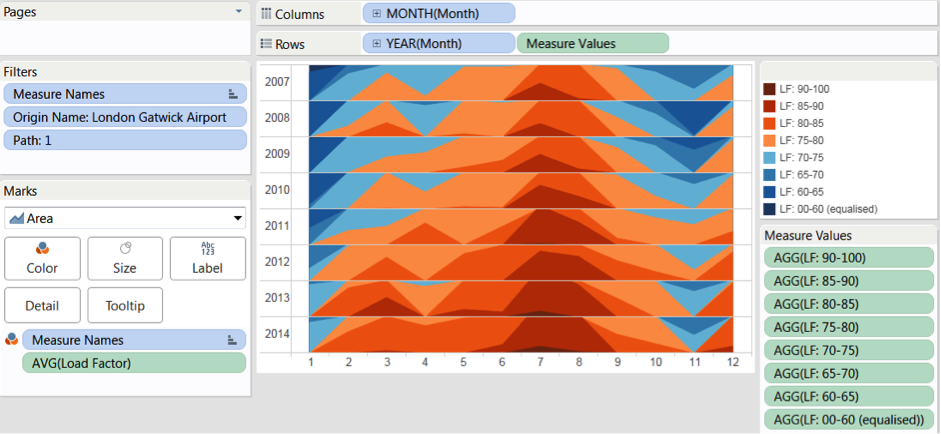
I used Joe’s technique in a visualisation I made to help travelers find direct flights:
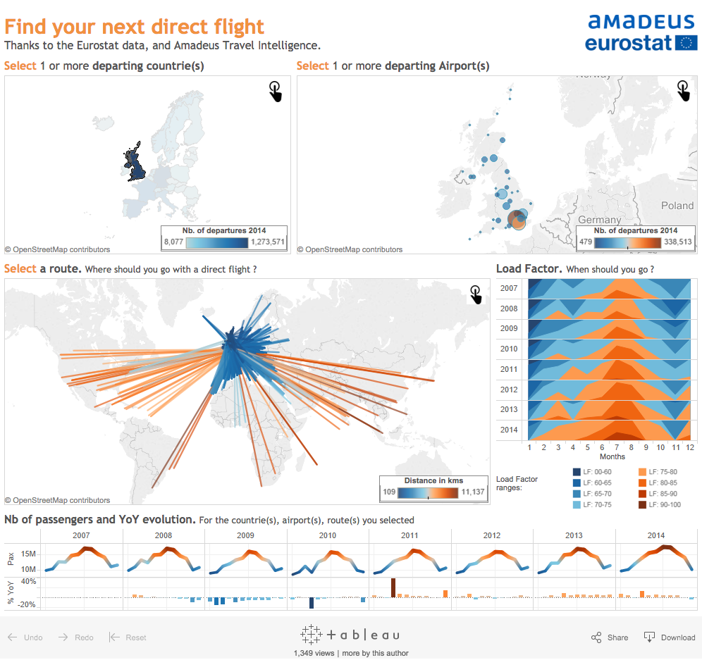

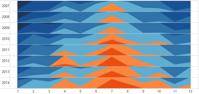
The calendar view helps people determine their departure date. It highlights the months when the flights are not full (load factor), which means tickets are less expensive. We can see that the flights departing from England are full in July and August (dark orange) and empty in January (dark blue). We can also see that the flights have been steadily getting fuller since 2007.
When is this approach useful?
This approach can be useful when you need to visualise marks that are on top of each other. When I first tried to visualise the load factor (% of seats that have been used), I used lines as I wanted to show how a measure was changing over time:
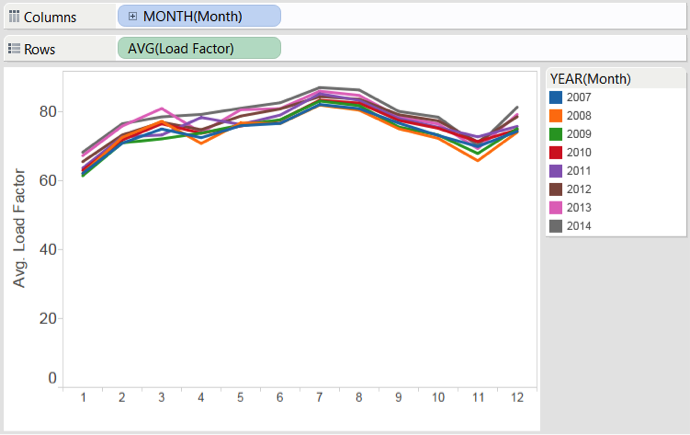
But we did not see much; there were too many lines within the same range. The years were also difficult to distinguish as I was using too many colors.
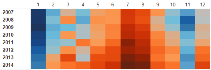
A heat map is another option, but it offers fewer details. Each cell can only have one color whereas Joe’s technique allows two colors per cell (year/month association). We can also keep the line shape with Joe’s approach.
How to create this viz
Here are the five steps to creating a horizon chart.
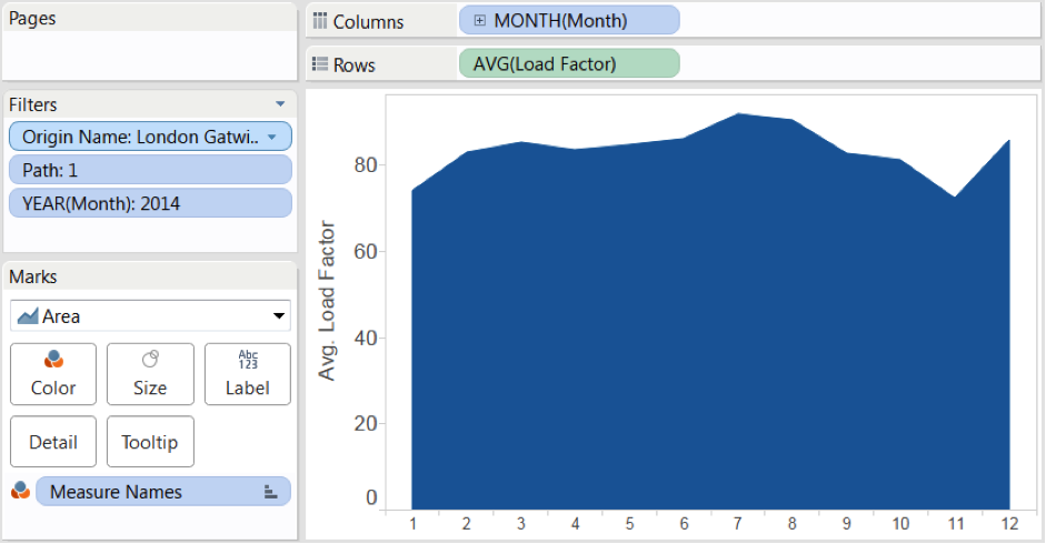
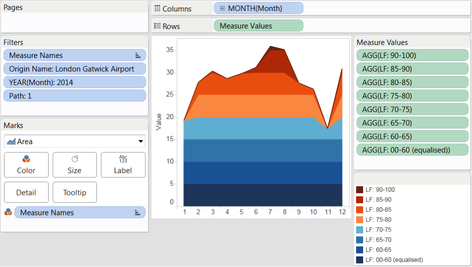
1. Visualise your measure with an area chart.
Let’s take an example. If we look at load factor (% of seats that have been filled) of all the flights that departed from London Gatwick in 2014 with an area chart, we get the graph below. (I hope you do not plan to depart from Gatwick in July. The flights were full at 92% in 2014!)
2. Cut the measure with a calculated field.
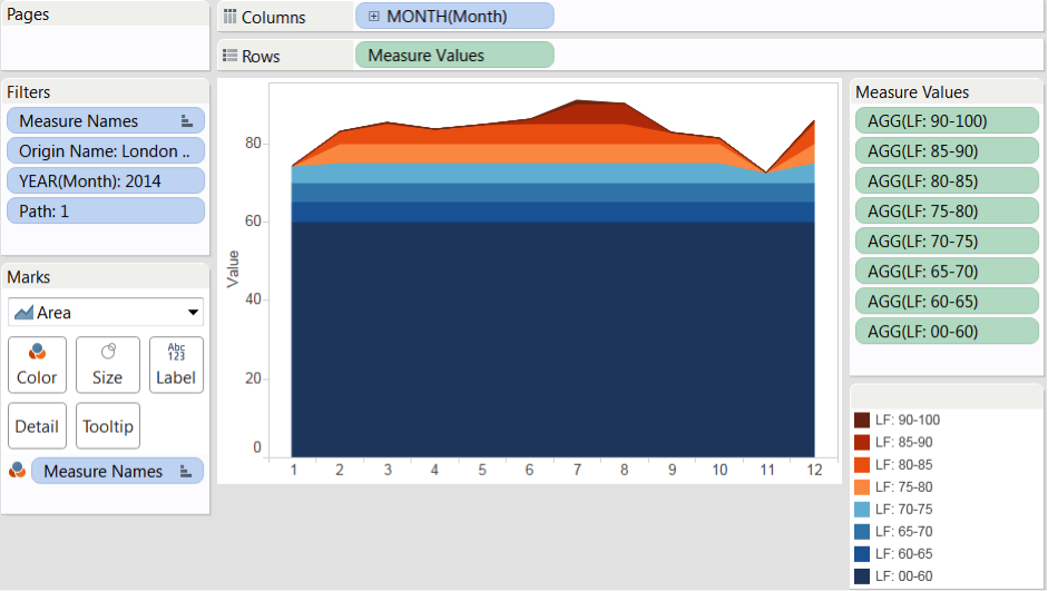
The trick is to “cut” the measure with a calculated field for each measure range for which you want to use a different color. Once you’ve created the calculated fields, you can display them on an area graph by having them share the same axis with a merged axis and by setting the stack mark option (menu > analysis > stack marks > on).
For the calculated fields, I used two “If” statements as we have three cases to consider. Here’s the calculated field for the load-factor range 85-90%:
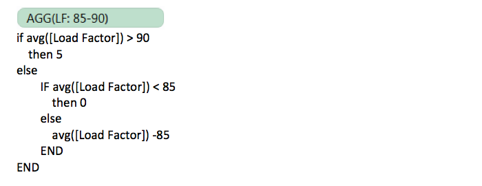
The three cases that the formula is testing for are:
- The load factor is higher than the range that we are considering (85-90), meaning it’s over 90%. In this case, the formula will return 5 as we want to draw an area with a height of 5 (5 points, our range).
- The load factor is lower than the range that we are considering (85-90) meaning it’s below 85%. In this case, the formula will return 0 as we do not need to draw anything.
- The load factor is within the range that we are considering (85-90) so it’s above 85 and below 90. In this case, with the other formulas, we’ve already added the areas up to 85; we only need to add what is left. So if the load factor is at 87, the formula would return 2 (87 minus 85).
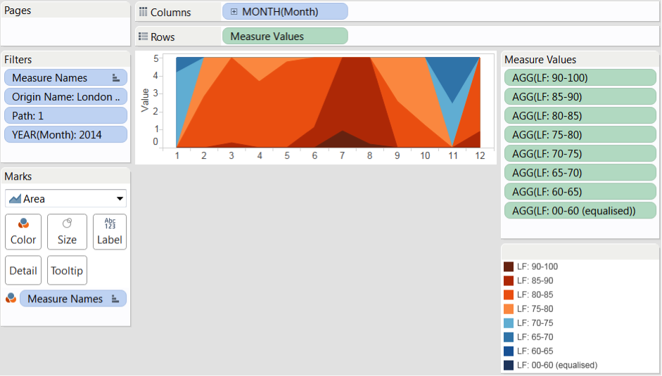
3. Equalise the cut sections.
I used only one calculated field for the load factor range 0-60% (a 60-point load-factor range) whereas I used only a five-point range for the other calculated fields. This is because the load factor rarely dips below 60%, so I do not need to use more than one color.
However, my goal is to superpose the calculated fields, so I need the calculated fields to be capped by an equal maximum, in my case five points. To do so, I need to change a bit the calculation I used for the 0-60% load-factor range:
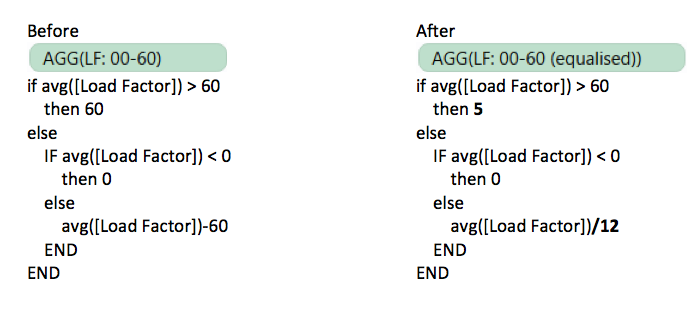
This is what we get with the new calculated field:
4. Superpose the calculated fields.
To superpose the calculated fields, you only need to turn off the stack mark option (analysis > stack marks > off). Do not forget to order the measures (calculated fields) in decreasing order. To do so, you need to make sure that the calculated fields are ranked in the "measure values” section.
So the calculated field made for the first band, in my example “LF: 00-60 (equalised),” must be placed on the bottom of the measure values section. And the calculated field made for the last band, in my example “LF: 90-100," must be placed on the top. If you need to reshuffle the calculated field order, you can just drag and drop in the measure values section.
5. Add a row dimension.
This is the last step! In my example, I’m going to drag “years” on to rows as I want to display a calendar.
And there you have it! I am glad to have shared this tip with you, and I hope this tutorial will help some of you. I learned so much thanks to the Tableau community, and I am more than happy to help in return.
For more tips, tricks, and vizzes by Yvan, check out his Tableau Public page and connect with him on Twitter @YvanFornes.
Zugehörige Storys

Visualizing Women's Impact to History Through Data Visualization
 18 März, 2024

Behind the Viz: Adrian Zinovei Helps You Design Your Next Dashboard
1 März, 2024

Charting the Heart: Data Visualizations on Love
 14 Februar, 2024
Blog abonnieren
Rufen Sie die neuesten Tableau-Updates in Ihrem Posteingang ab.