Don't Use Your Words: Research on Icon Generation Gets Noticed


Dashboard authors want to help their audience make sense of data as quickly as possible. With categorical data--like sports teams, countries and brand names--one way to do this is with custom icon sets that map easily and visually to the categories they represent. Tableau users can do this using custom shape files. But what if Tableau could take one quick look at your categorical data and search the Internet to find the best icons for you, importing them automatically? That's one of the very cool ideas our R&D team imagined, and the research behind it has just been accepted at the ACM SIGCHI conference, the top academic conference on human-computer interaction. Read on to learn more about this exciting research.
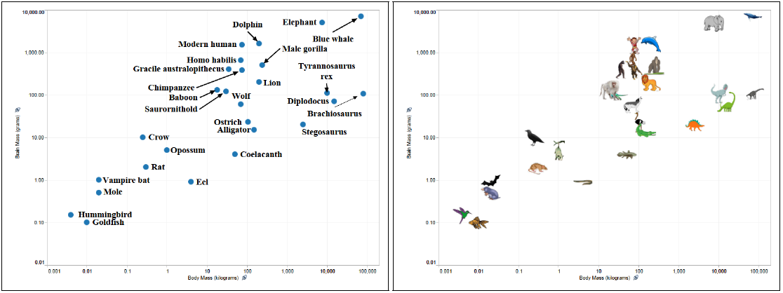
Take the example above, which shows animals' ratio of brain to body mass on a log-log scale--a good heuristic for intelligence. Because the cardinality of the data is high, it wouldn't make sense to put an animal's species on color. As a result, the scatter plot on the left requires the audience to read each label in order to draw conclusions about the data. The scatter plot on the right, however, uses icons, allowing the user to intuitively understand that modern elephants would totally beat the dinosaurs at chess.
Getting the algorithm right
Dr. Vidya Setlur, a research scientist at Tableau, has been exploring the intersection of data visualization, computer graphics and natural language processing in her work. She developed an algorithm that parses the underlying XML generated by Tableau to gather information about a data set's categories. The algorithm then uses WordNet, a database full of information about how English words are related, to enhance the set of words that can be used to describe the categorical data in the set. Lastly, it talks to Google's Image API to return appropriate images for each category, appending search terms that encourage Google to return easily identifiable icons rather than more detailed images or photos.
To see if this algorithm produced quality results, Dr. Setlur evaluated it against a representative sample of Tableau Public workbooks that use custom icon sets. Nearly 500 workbooks were used in the test. A Tableau Public author had already created an icon set for their data, and then Dr. Setlur's algorithm created its own icon set. After, she asked subjects on Mechanical Turk to decide which icon set was best for the categories; in 79% of cases, the MTurkers either preferred the auto-generated set or said the two sets were equally useful. The higher the cardinality of the data, the more likely users were to prefer the auto-generated icons.
"These findings build toward the larger research goal of automating tasks so users can stay in the flow of visual analysis, and they're not distracted by 'Oh, I need to get X or Y,'" says Dr. Setlur.
A diverse and integrated R&D team
Dr. Setlur's research background is in computer graphics, HCI and natural language processing, which offers her a unique perspective in an R&D team focused on data visualization.
"I'm able to develop approaches that other people might not consider," she says, "because I come from a non-mainstream research upbringing with regards to data viz."
She says that being part of the research team at Tableau is unique to begin with.
"Unlike other research labs, we're a part of the larger development team. This has two advantages. First, as a researcher, you're closely in sync with the product roadmap and the feature teams. Second, you're able to collaborate with other engineers on topics of mutual interest."
Dr. Setlur says these factors foster a culture where research feels meaningful and impactful to the overall mission of the company.
Although she's focused on helping Tableau's customer see and understand data, Dr. Setlur was pleasantly surprised to have her research accepted to such a prestigious conference.
"It's promising that an idea we find useful within the company is also positively received in academic circles," she says.
This feature is not yet slated to appear in a Tableau release, but it's an exciting glimpse at the body of research produced by our R&D team as we focus on a mission to help people see and understand data.
Subscribe to our blog
Get the latest Tableau updates in your inbox.